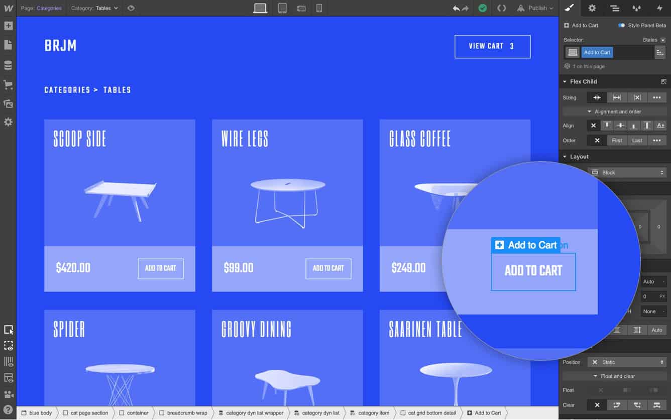
Adding-to-Cart is a defining feature for eCommerce website design, which is why so much emphasis is placed on enhancing it to drive sales for eCommerce in Singapore. It’s the first real step that any online visitors takes in their purchase journey upon landing on your site.
Some eCommerce websites employ a bright coloured Add-To-Cart button which does attract attention, but it takes more than that to get your visitors to click on it and subsequently convert.
So, what gets customers clicking on the Add-To-Cart button faster?
Fixing The Add-To-Cart Button
As mentioned above, a strongly contrasted Add-To-Cart button that can capture the attention is a good first step. The position of the Add-To-Cart button matters as well.
Beyond that, the button should be positioned above the fold and on the right of the product image in the individual product page. There should also be plenty of space around the button to make it stand out properly with nothing overlapping or cover it.
If possible, make the Add-To-Cart button be visible in the product listings page as well to increase the accessibility for users.

(Image from Webflow)
Great Product Photography
Images of the product are often the deciding factor for consumers before they purchase, which is why having proper and legitimate product photography is critical for eCommerce website development.
Do you really want customers to see low resolution and hastily taken photos of your product as they ponder over their purchase?
As an experienced Singapore eCommerce solutions provider, we definitely recommend that you invest some time and resources into your product photography.
Mobile Optimisation
Almost 75% of Singaporeans shop with smartphones, which is more than a significant portion if you ask us. Adapting to this trend, your eCommerce website development has to be mobile optimised into account.
Generally, website designs of today take mobile-responsiveness into account and it’s time to apply that same priority to the eCommerce industry. A mobile-responsive eCommerce design affords customers the same user experience regardless of their screen size.
Any offers, payment methods or functions on your eCommerce site should also be tested on mobile devices for its performance.
Promo Codes Pop-ups & Remarketing
With the abundance of information and options available, online shoppers often take some time to ponder over their purchase decision. During this stage, a promo code that saves them some dough can push them over the edge to add that item to their shopping carts.
Simply add a well-timed pop-up with an expiring promo code that triggers when users tab away from the website. Or you could employ a remarketing strategy through Google Adwords that would place the product in consideration with the same strategy.
All of these tips will definitely boost your Add-To-Cart rates and improve your numbers.
Considering these options but unsure of how to go about running it? A full-service digital agency in Singapore might just be what you need!
Find A Pre-Approved PSG Vendor For Help
What better ways to improve your business than to approach an experienced Singapore eCommerce website design company for help?
As a pre-approved vendor for the Productivity Solutions Grant (PSG), we can provide eCommerce solutions at a heavily subsidised rate for your business (if you’re an SME). Contact our sales representative to find out how today!


