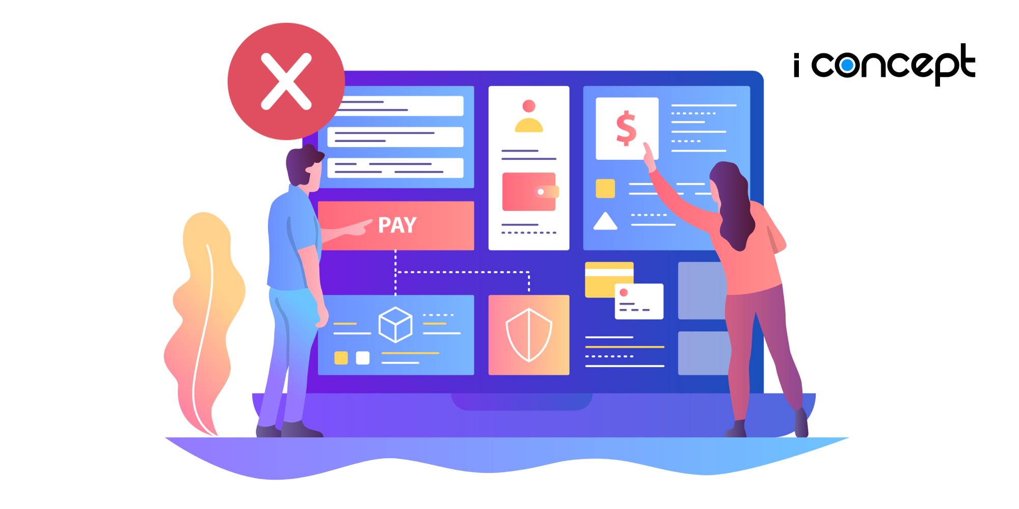
If you don’t want to miss out on a growing population of 1.92 billion buyers in 2019, it’s time to focus on your eCommerce website design. That’s right, the eCommerce industry is booming and it shows no signs of slowing down.
To tap on this huge group, it’s vital that you design an eCommerce website capable of attracting them to purchase your products or services. Avoiding common mistakes in your eCommerce design is the first step to achieve high conversions.
Looking to develop an effective eCommerce in Singapore? Steer clear of these common mistakes of eCommerce website designs!
Lack of Quality Product Images
The last thing that users are looking at before deciding to purchase your product is your product image. If you don’t have high-quality images of your products, then you are going to struggle to get users to buy.
Users want to be sure of exactly what they are purchasing and images are the best representation of your product. Hence, low-resolution, badly cropped or unclear images are a definite no-no.
In the event that you are taking the photos yourself, be sure to choose the right background that highlights the product and consider at least one image which shows the product being used. Do consider approaching a professional photographer for your product images if you’re unsure.
Not Being Mobile-Responsive
Mobile eCommerce accounts for more than half of digital sales in 2019, which means you need to keep mobile devices in mind in your eCommerce website design. A foolproof method that allows you to cater to the masses would be to incorporate a mobile-responsive design for your eCommerce.
A responsive design ensures that your site can be viewed and accessed easily on small, large and medium screens. Google is also penalising sites that do not provide responsive design. As such, if you don’t have this feature as part of your design, then there’s a strong possibility that your Search Engine Optimisation (SEO) rank will take a hit.
Psst… Rank your websites on the first few pages of search engines with the help of SEO experts and watch your eCommerce website traffic grow!
Complicated Navigation
Easy access, easy navigation and easy usage, these are 3 ways to ensure that a user’s experience on your eCommerce website is painless and smooth. After all, their experience likely dictates the probability of whether they purchase on your eCommerce platform
One simple feature to include is a visible search bar on the home page for users to find any product that they might want. Of course, it’s not just about navigation to find a particular product – purchases should be kept simple as well. By keeping the marketing funnel short, you are less likely to lose users along the way. This means that multiple pages and popups should be avoided where possible.
Improve your eCommerce’s user experience by consulting a professional eCommerce web design agency will be able to help you with the right structure to ensure that this is the case.
Lack Of Clear Information And Instructions
Your eCommerce website should consist of all the information that a customer could need before they commit to a purchase. This includes any additional costs, returns and refunds policies and warranty periods.
Hidden costs and lack of information contributes to poor user experience that turns consumers away and impairs conversion rates on your eCommerce site. If you don’t want high bounce rates and low SEO rankings, abstain from these practices.
The best ways to go about this is to create an FAQ section as part of your eCommerce design. That way, users will be able to find all the information they need in one place. A lot of eCommerce in Singapore will put this information in the footer section of a page to ensure that users see it when they scroll down.
A Basic Design
There are countless eCommerce websites online and if your eCommerce design looks like every other option, you are not giving customers reasons to choose your business over the competition.
Taking concrete steps to customise your eCommerce platform to create an eCommerce design that is different and stands out from the rest. Ideally, your design should also send a clear message about your company.
Not Getting Professional Help
Don’t struggle with designing your eCommerce website on your own! Approach a fully equipped team of eCommerce developers to help you design the perform eCommerce platform for your business. We’re also a pre-approved vendor for the Productivity Solutions Grant (PSG) that allows up to 80% subsidy for SMEs looking to develop eCommerce solutions. (;


