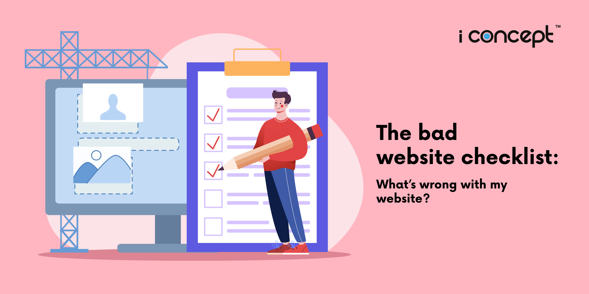
Is your website lacklustre, stuck in the past, or simply not performing the way you want it to? Do you get website envy when you look at your competitors’ sites? Sounds like it’s time for a website overhaul.
Before you jump in and start proposing a bunch of changes, or maybe get busy searching and hiring a digital agency, take a step back and make sure to determine which areas of your website are lacking.
And that’s where this article comes in. Here at I Concept Singapore, we’ve compiled a list of bad website design and website development-related issues, so that you can pinpoint the problem areas on your own company’s site.
- You have poor or no content
Imagine arriving at a website and there’s nothing (or almost nothing) there. Maybe you see a picture or two and a smattering of words, but nothing of value. Are you going to stick around? No way. As the master of your site, you don’t just need to get your potential customer there; you need to capture their interest and provide them with what they want. Most people will be looking for information, so give them some substance. If you’re a business, this means letting visitors know what you do and including descriptions and pictures of the products and services you offer. Reviews or testimonials make it even better! A lack of content will not only frustrate your visitors but will hurt your Search Engine Optimisation (SEO) efforts. Google goes so far as to state, “One of the most important steps in improving your site’s ranking in Google search results is to ensure that it contains plenty of rich information.”So get working on filling your site with quality, relevant content.
- Your site loads painfully slow
People are inherently impatient. Even if you have gripping content and a gorgeously designed site, they’re not going to sit around and wait for it to load.According to one study, 40% of people give up and abandon a site that takes more than 3 seconds to load. That can translate to big losses. A 1-second delay in a page’s response time can result in a 7% drop in conversions.Things that can easily bog down your website? Too many images, large files, bits of unnecessary code, as well as excessive use of CSS and JavaScript.
- Your contact information is buried or missing
Both a pro and a con of the Internet is that it can be an anonymous place. If customers aren’t familiar with your company, they need some reassurance that there are real people behind your website. They need to feel confident that when they place an order for something, they’ll get what they expect.Something as simple as having your contact information in an obvious place can add legitimacy to your site and go a long way in building trust with potential customers.Be sure that your phone number, email address, and physical address (if you have one) are easy to find.
- You lack clear organisation
People visit your site to gather information about your company or products. Don’t make them work too hard to find what they need! Here are two things that make for simple organisation in website development:
1. An easy-to-find search box — This allows customers to quickly hone in on exactly what they’re looking for.
2. Headings – They should let the visitor know what kind of content they can expect to see in every section. This is beneficial for SEO purposes as well! - Your design is uninspiring and/or not user-friendly
While substance and organisation are essential, it’s also important to keep in mind that appearances matter in website design.If your website looks outdated, clunky, or is using clashing colour combinations, people will quickly move along. Sometimes it’s the little design elements that get overlooked. Even a minor tweak can have a significant impact, so don’t neglect to take into account details such as font styles and size. Sans-serif style fonts are best, since they’re easier to read on computer screens. Also, don’t be afraid to go big.Not sure what your customers will like? Test it out on them! Ask for their feedback on Twitter or Facebook, so you can be sure you choose something that works.
- You have no call-to-action
This one seems pretty obvious, but you’d be surprised by how many websites fail to have clear calls-to-action. Studies have found that 70% of small business B2B (Business-to-Business) sites lacked calls-to-action.You may be thrilled that someone is visiting your website, but that’s not the end goal. Your aim is to push the visitor further down the conversion process. You can accomplish this by having a specific action you’d like them to take, whether that’s signing up for your newsletter, downloading an eBook, or, better yet, making a purchase. So, don’t forget to include a prominent call-to-action. You don’t want to miss a golden opportunity.
- Your site is not responsive
We’re talking about mobile responsiveness here. That’s one key thing in digital solutions today.
The number of people using mobile phones keeps ticking upwards and needs to be taken into consideration when you design your website.There are now over 10 billion mobile phone connections in the world, and the majority are owning and using smartphones.
A large segment of your customers will likely reach your website from some mobile device, and you can ill-afford to give them a lacklustre experience. Your site may look great on a desktop computer, but if it takes forever to load on a phone, or the images and content look funny, people will quickly ditch your site and move to your competition.
Nowadays, people tend to do their research in chunks. They might start researching your product by browsing on their laptops but jump over to their smartphones (or tablets) later to make transactions. You’ll want your site to look consistent, no matter the device they’re using. This is why it’s imperative that your site is responsive. - It’s filled with little annoyances.
You know them. Music blaring as soon as you click on the site. Automatic videos that start rolling without clicking on anything. Pop-up ads that fill the screen.These types of bothersome intrusions make most visitors want to flee. Your site should be welcoming and allow people to choose their experiences by visiting specific pages, clicking on specific videos, and opting in to music. They’ll respond so much better to this than having a multimedia extravaganza chosen for them.To see meaningful results from your website, you don’t necessarily have to invest in an expensive web designer or go all out with a complicated website design. Remember, the aim of your site should be to benefit those looking for information about your business and products. Keeping it simple is sometimes best.
Build an inclusive site that performs well
By keeping in mind what makes a bad website and implementing a few of the tweaks above, you’ll be one step closer to converting those site visitors to customers.
Looking to create a new website for your business, or seeking to refresh your brand’s webpage? Not too sure how to create the best user experience for your users? I Concept is here to assist you!
As a leading creative digital agency Singapore, we offer a range of digital solutions, from website and e-commerce store design, and comprehensive digital marketing strategy advice. Our team of professional UX designers and programmers are ready to help in your website development. Speak with us today!