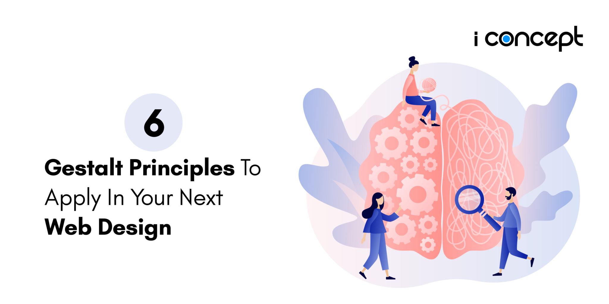
Psychology and website design are interconnected with each other more than you’d think. In fact, it’s an integral part of any User Experience (UX) and User Interface (UI) design process. Ultimately, every website designer is looking to design for the user. Hence, gaining a deep understanding of how users behave and interact with your design is important. You don’t need a diploma in psychology to successfully design a website, although, it’s good to learn the fundamentals. First off, “Gestalt” means “unified whole” in German. Gestalt psychology is a school of thought that was founded in the 1920s on the basis that the human mind perceives things as a whole. With this in mind, we will explore 6 principles — proximity, similarity, symmetry, continuation and common fate — that may come into play for your next website design. Let’s dive right in!
-
Proximity
As obvious as it may sound, humans tend to group items that are close to one another as a whole. In the web design context, it means that users will tend to identify design elements as a whole when placed closely together. This is important to note as the placement of text and various design elements are key to providing context for the user. You don’t wish to leave floating elements for the user to question its purpose. Proximity is also a recurring principle in the concept of visual hierarchy. Here’s an example of how our creative agency applies the law of proximity to provide context for the web visitor:

Photo courtesy of I Concept Singapore
Let’s just say that keeping a safe distance when you’re headed outside is crucial but that’s not necessarily the case when it comes to website design.
-
Similarity
So if you want to collect a basket of apples, you wouldn’t put oranges in it. The law of similarity works the same. This includes grouping a group of items with similar characteristics. In order to establish the relationship of specific elements, there are multiple characteristics to identify from the font choice to font size, colours, size and even orientation. This is how Starbucks Singapore distinguishes the header text from its sub-header:

Photo courtesy of Starbucks Singapore
By exploring different ways to display the header text such as size and orientation, this is how the brand plays with its design elements. With the similarity principle, it is possible to improve your next website design for clearer distinction.
-
Symmetry
Exploring symmetry is a fun way to spice up your website design. Not only is it aesthetically pleasing, but symmetrical elements can also create harmony and make your website look more dynamic. Of course, in today’s digital landscape, symmetry in a website can be deemed as boring and dull. You could also explore asymmetry in web design to give off a more edgy vibe to match with the current trends. Let’s have a look at how Gucci’s spring-summer ‘18 collection works the magic of symmetry:

Photo courtesy of Gucci
Explore symmetry or asymmetry in your next web design and see how it can yield effective results!
-
Continuation
The law of continuity suggests that lines are perceived to follow the smoothest path. This essentially means we tend to see objects arranged in lines or curves as a whole. By creating a visual connection, this concept of creating lines will help to lead users to where you want them to. One common usage of the law of continuity would be how we view Google Maps:

This is how Google Maps communicates to its users where they should be led in the event they were searching for a particular location.
-
Common Fate
Humans tend to perceive elements moving in the same direction to be related. As compared to stationary elements or those that move in different directions, our brain perceives things in the same motion are categorised as one collective element. Simply put, animated design elements that move together are usually identified to be in the same group. An illustration of the principle of common fate would be the home screen of your Netflix account:

Photo courtesy of Netflix
More often than not, the concept of common fate is used in various aspects of our lives. For instance, upon landing on your Netflix home page, you will notice that a series of shows are lined up to highlight to you a list of shows that are recommended or trending. So everything seems pretty stagnant until you hover over a particular show where it would start playing a trailer and hence, succeed in performing its job in grabbing your attention. The movement in one thumbnail is distinctive as we naturally are able to identify movement in a sea of static thumbnails. Naturally, we are inclined to be drawn to any distinct changes to the motion of any objects. This concept of common fate can be particularly effective in the case of menu bars or Call-to-Action (CTA) buttons where you wish to draw web visitors too.
-
Closure
As the name suggests, this last principle refers to our innate ability to connect individual design elements as one recognisable pattern. Let’s bring your attention to the logo of Beats by Dre:

Photo courtesy of Beats By Dre
Although it doesn’t take a genius to figure out that the logo states the letter ‘b’ here, it also shows how we all love to draw conclusions. Not so much so in the way that girls jump to conclusions (have done so myself).

But in the design aspect, rather, humans tend to find the need to fill in the missing puzzle piece when presented with incomplete information. Hence, the principle of closure can be a tactical tool for designers to devise the exact conclusion you would want your web visitors to draw. Whether users will be enlightened or misled, is completely in your hands.
We hope you’ve learned a thing or two about the Gestalt principles so far. And if you’ve noticed, these laws go beyond just design and can be applied to our daily lives as well. Now it’s time to take these points back and apply it to your own designs! Alternatively, if you’re looking for functional and intuitive website design, we could be the solution for you. Talk to our brand guardians and let us deliver just that for you.