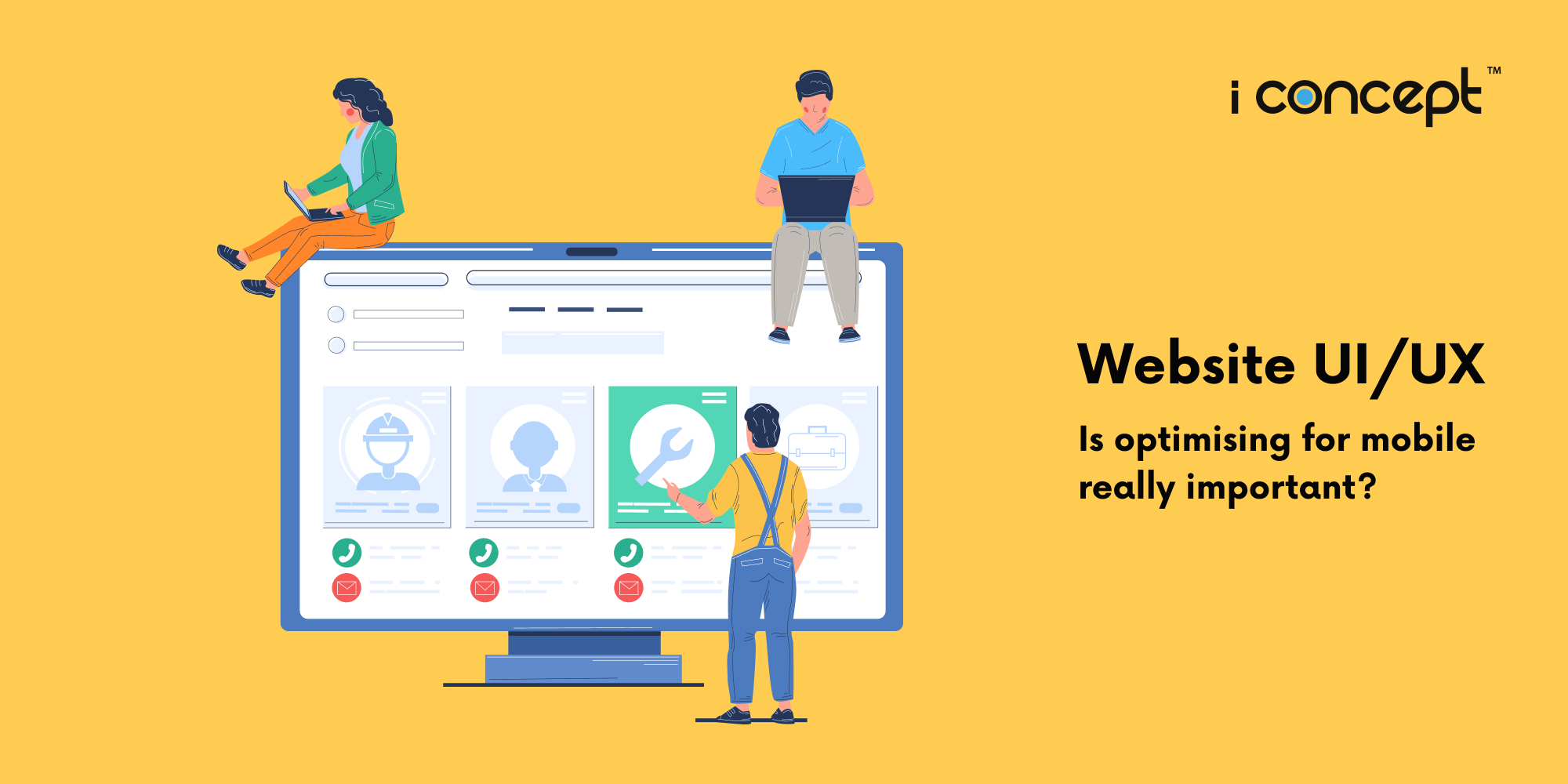
I’ve designed a pretty website, and every element is created for a purpose. I don’t want any compromise or any changes. Do I really need to optimise my website for mobile users?
If you care about your users’ experience with your website, then the quick answer is a definitive ‘Yes’!
We continue to see a high growth in mobile phone usage, and even more in mobile shopping, in recent years. People are using their phones and mobile devices in different ways, both for work and for leisure. And while a good number of traffic to a website is via the traditional screens (personal computers and laptops), at least half comes from mobile screens.
One big thing, as mentioned, is mobile shopping. E-commerce sites are becoming the key to mobile usage. While going on shopping applications, or developing your dedicated apps, are prime options, having your website optimised for mobile use is a better way out.
Research shows that mobile users in general prefer mobile websites, especially for shopping, to know about product prices, checking reviews, and buying. It affects the viewing and e-shopping itinerary, interactions with the website and brand, the responsiveness and overall pleasure of using the website.
And generally for all websites, having a well-optimised mobile website means users won’t have to scroll endlessly to get their desired information. The menu is always “thumb-friendly” and within reach for easy accessibility, and the overall design aesthetics doesn’t get compromised due to distortions or lag, which does happen to non-optimised websites.
When comparing website designs there are two broad classifications of designs to look at: mobile-optimised and mobile-friendly. A mobile optimised website is by far the most advanced type of design. By being mobile optimised, the site will reformat itself completely for different devices. They are guaranteed to have better mobile web performance because the site will reformat itself for certain handheld devices. The process of reformatting ensures your website can engage a large mobile audience.
A mobile-friendly website design is not quite as good as a mobile-optimised site, but it will still load properly on all devices (desktop, tablets, and mobile). Websites need to be perfectly functional on all devices and the mobile-friendly option is a great choice to ensure that. A mobile-friendly site will be easy to navigate, with large buttons and command options. However, there are times when mobile-friendly websites do not load as desired, or the website design itself may be too clunky, and unsuitable for single-hand surfing on certain mobile devices.
With new devices always changing, having a mobile-optimised website is much preferred. Many organisations and businesses have already implemented mobile-friendly websites. Website owners should understand how their website will display on a variety of devices and how to make sure it displays well. With the understanding that the majority of Internet traffic comes from mobile devices, it is easy to see the importance of mobile optimised websites.
Another advantage is that it helps to build credibility, whether it is with customers, clients, or in an industry. Mobile optimised websites allow more customers to be reached at a quicker rate, proving to be very beneficial. A crucial advantage is that it can increase customer satisfaction.
There are many steps that a website owner can take to improve their website, whether done by themselves or professionally. These improvements can prove to be quite beneficial when used. The first tip of advice is to incorporate large buttons for call-to-action (CTAs). The less precise clicking that is required on a mobile device, the simpler it can be for the user, resulting in less mis-clicks.
An important step that website owners should take is to ensure that navigation through the website is easy, vertical navigation is preferred. The user should be able to navigate the site, quickly and easily, to find what they are looking for in as few steps as possible.
On a mobile-optimised site, the graphics are reduced, so they don’t interrupt the user’s path to the critical information they are seeking.
It is also noted that, allowing the user access to view the desktop version of the site (an option button often found at a corner of a mobile-site) can be a very beneficial feature.
There are many options to go about optimising your website for mobile, improving its user interface and experience designs. Should you require help in this, or just getting out a website (both web-version and mobile-optimised one) for your brand, I Concept is the creative digital agency to contact.


