Website design has seen countless colour palette trends fade in and out throughout the years, from mono-colour website themes to pastel and vivid gradients.
One thing’s certain though – Choosing the right website design colour palette is what makes your website memorable, trustworthy, attractive, and profitable. Essentially, the first impression is everything.
If you’re drawing a blank on what and how to use colour on your website the right way, check out these 5 beautiful websites with versatile colour palette schemes that’s sure to inspire you!
1. COWBOY.
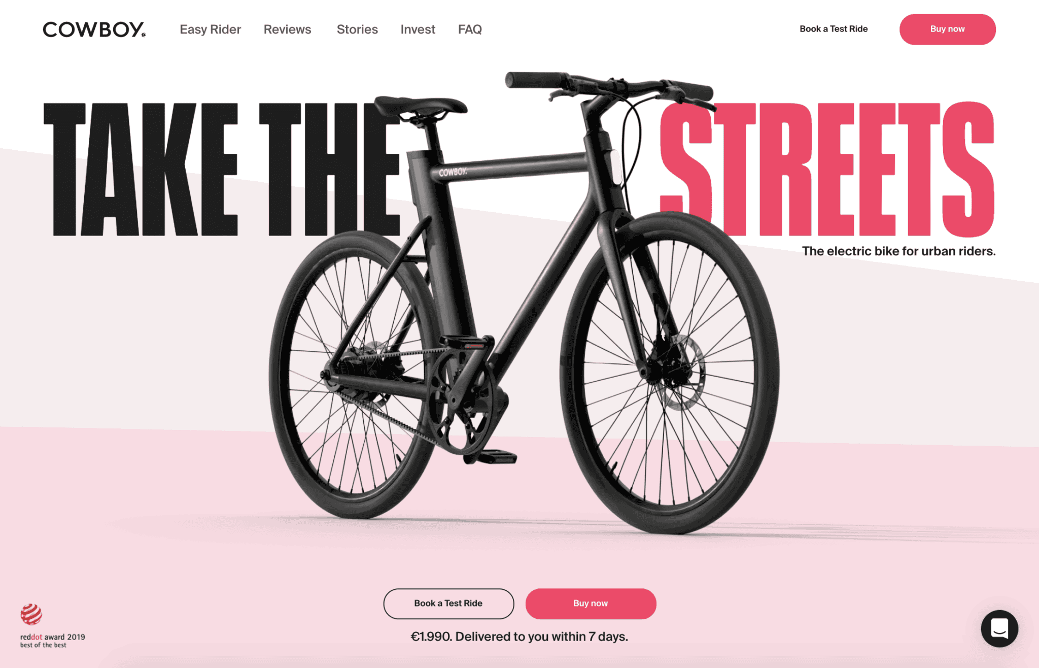
COWBOY. distinguishes itself from competitors by selling electric bicycles through a modern and sleek website design that utilises a black and pink palette. It’s an immediate attention grabber as the soft pink tones in the background make the charcoal black bike more prominent and the focal point for the homepage.
Also, we often assume that pink can only be used to attract female demographic. However, by beautifully merging masculinity with the pink palette, the brand perfectly appeals to both men and women. Hence, the right website design colour schemes can help you subdue typical stereotypes relating to “male” and “female” colours.
2. Konstantopoulos S.A.
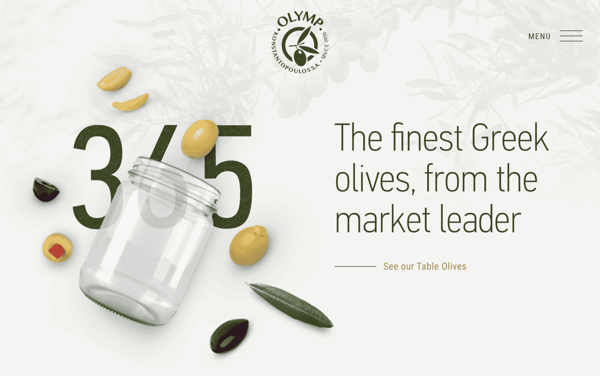
The website colour palette for Konstantopoulos S.A. draws its inspiration from the use of harmonious earthy tones that are easy to look at and white space to create a stunning clean and fresh homepage.
Despite the fact that olive green is the primary colour, it’s used sparingly throughout the homepage. As a result, the green logo and text seem to have a more prominent presence on the homepage.

3. The Robin Collective
The Robin Collective, a creative mix of artists and designers, greet you with an explosion of eclectic colours when you land on the homepage. The bright yellow background evokes joy, sunshine and positivity, while the additional shades of blue, pink and orange add a playful vibe.
If you’re thinking about using a highly saturated colour palette for your website design, make sure to add some neutral tones like white and grey, to balance out the overall effect flawlessly.
4. Bang & Olufsen
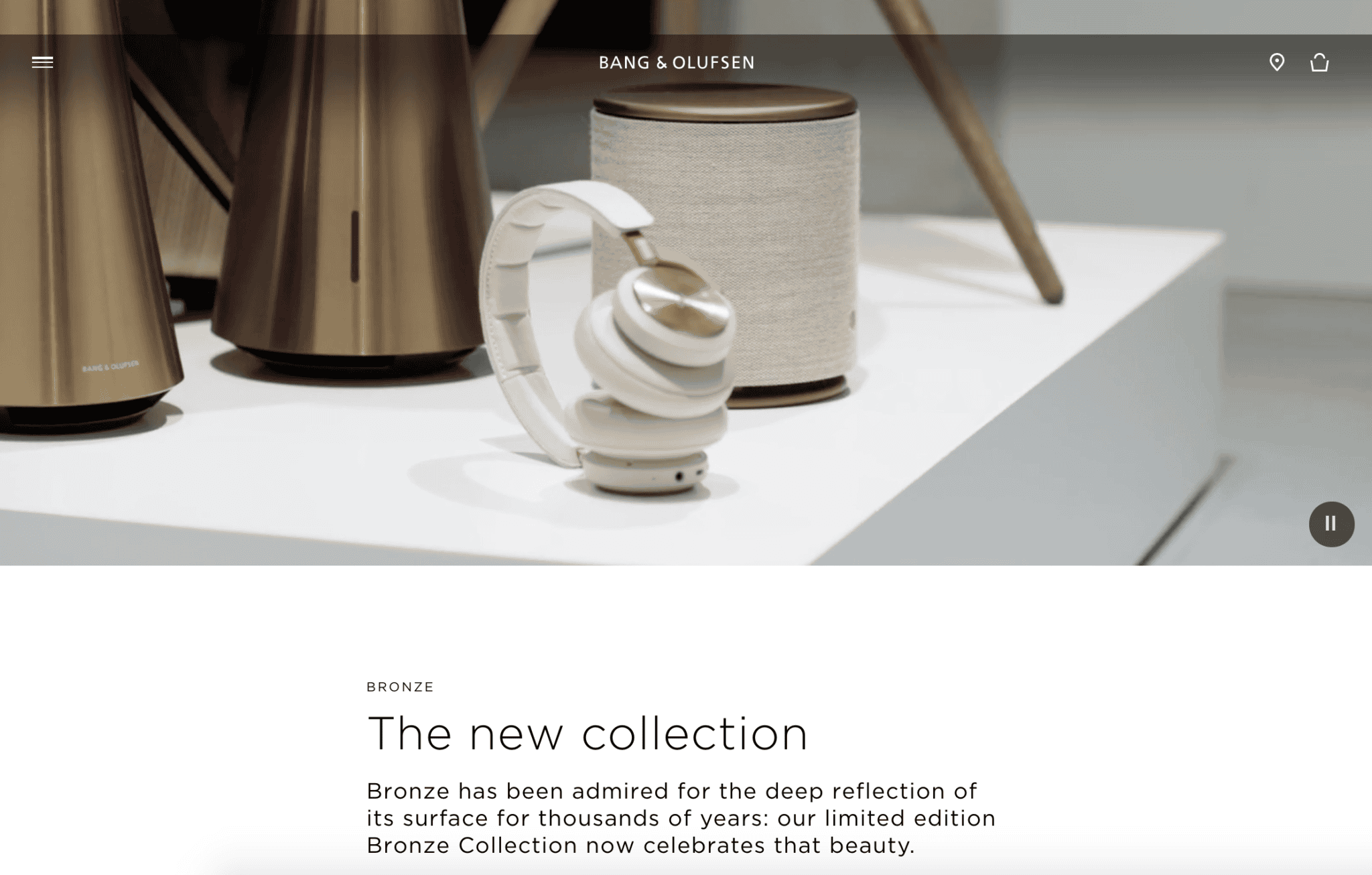
Luxury electronics company, Bang & Olufsen have elevated their brand identity by employing a beautiful artistic style – a bronze themed palette throughout the homepage.
A rich classic gold, combined with light shades of cream and grey form a luxurious sensation. The colour palette is further accentuated with metallic elements to add depth and breathe life to the brand’s aesthetics, evoking elegance and sophistication.
5. Stripe
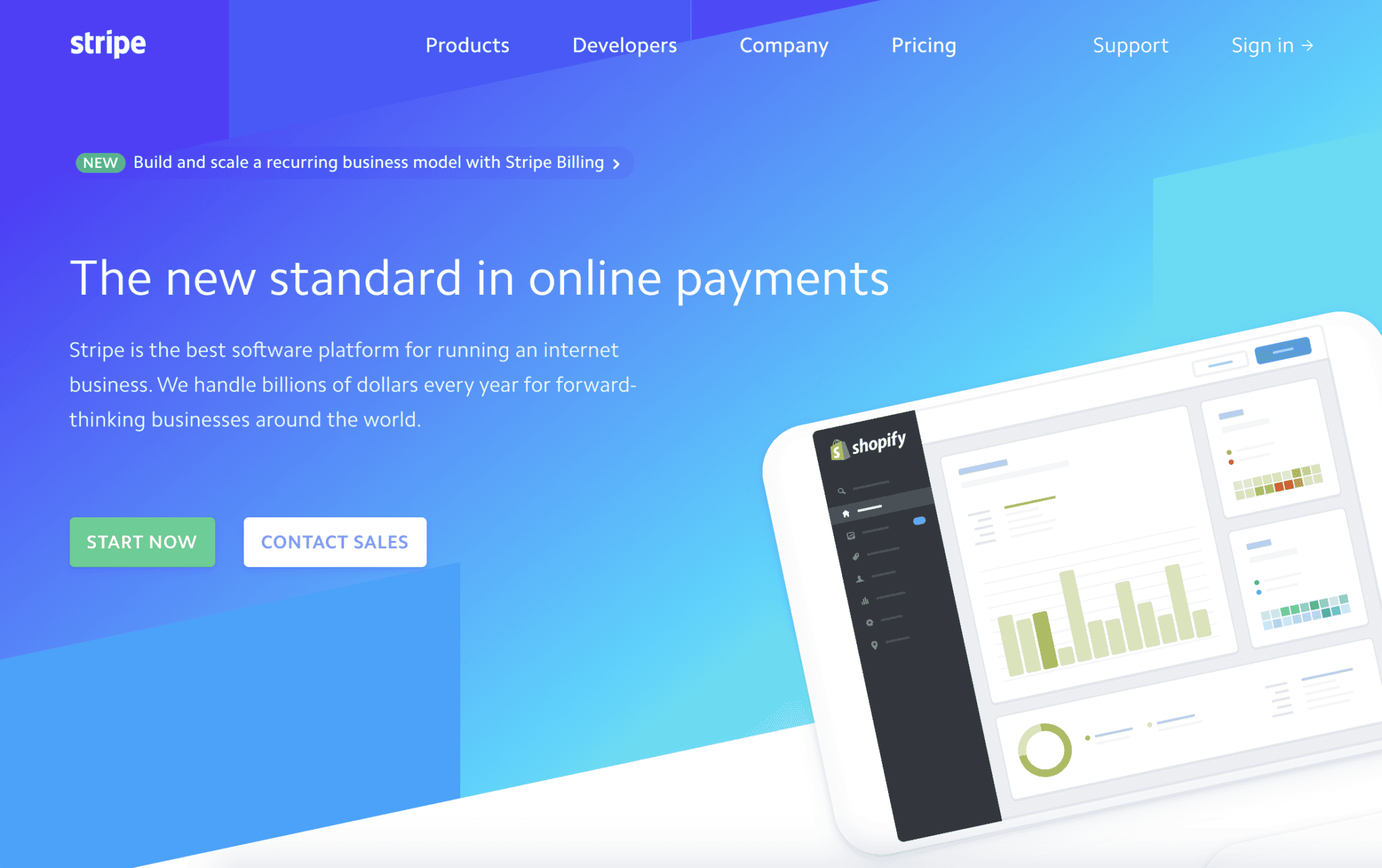
Stripe, a payment processing software for online businesses, used a website design colour palette that’s been steadily growing in popularity over the years – gradients.
To stay up to date with all the latest tech trends, Stripe took a very simple blue colour palette and blended it with different tones like green and white to give the overall homepage a modern and visually appealing first impression that looks great on any device at any resolution.
Ultimately, a good website design colour palette should not only reflect your brand, but also appeal to your audience. Choosing the right website design colour palette doesn’t have to be hard. All you have to do is to:
1) Match your brand with the right dominant colour
2) Matching the dominant colour with accent colours
3) Matching the background colour with your dominant & accent colours
Moreover, whether you’re looking for a creative website design, a corporate website befitting of the professionalism of your business or an ECommerce website that fits your brand’s unique tone in the new year, rest assured that our team of web designers have the expertise and passion to deliver the most beautiful colour palettes for you, to you. Engage our consultants today!


