Everyone loves beautiful websites that’s focused on the user experience, and built in a way that’s both stylish and timeless. But in a competitive industry that constantly begs the question “How can I be more creative?”, having a consistent influx of website design inspirations that convert can be challenging.
Fret not however, we’ve rounded up 5 of the best and latest website designs that will help inspire your next project in 2020.
-
Incorporation of Bold Colours
As more brands seek to stand out online, the inclusion of bold and beautiful imagery has become the norm for today’s website visitors. Not only does the usage of bold colours reflect the growing sophistication of consumer technology, it also demonstrates a brand’s forward-thinking, daring culture, and in some instances – eccentric personality.
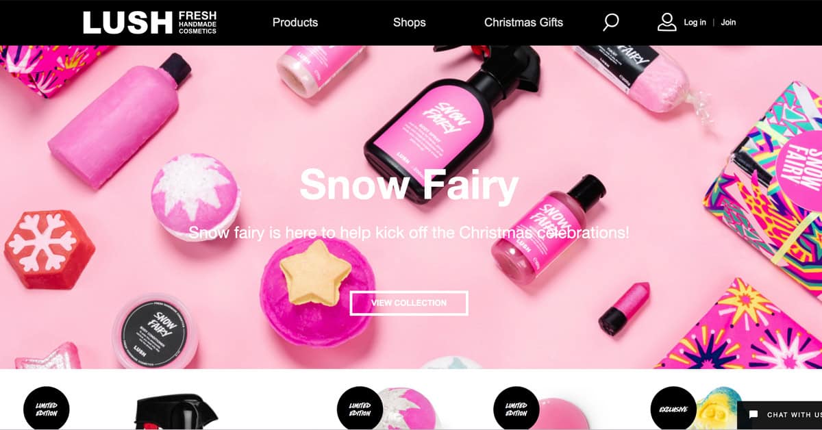
Lush Cosmetics is an excellent example that effectively uses a striking colour palette, with distinct images and a bold font to “hit home” with their quirkiness.
 Source Link: https://uk.lush.com
Not only are the brilliant and deep colours immersive, but they’re also attention-grabbers, which is something many online brands can utilise. Partner that with a straightforward and to the point brand messaging and you have a website design that inspires loyalty and increases brand association.
-
Responsive Sliders
For your website design to be advantageous for the brand utilising it, the importance of space conservation must be considered. Why responsive sliders are a good fit for dynamic websites is because this website design element lets brands display more content, in lesser space.
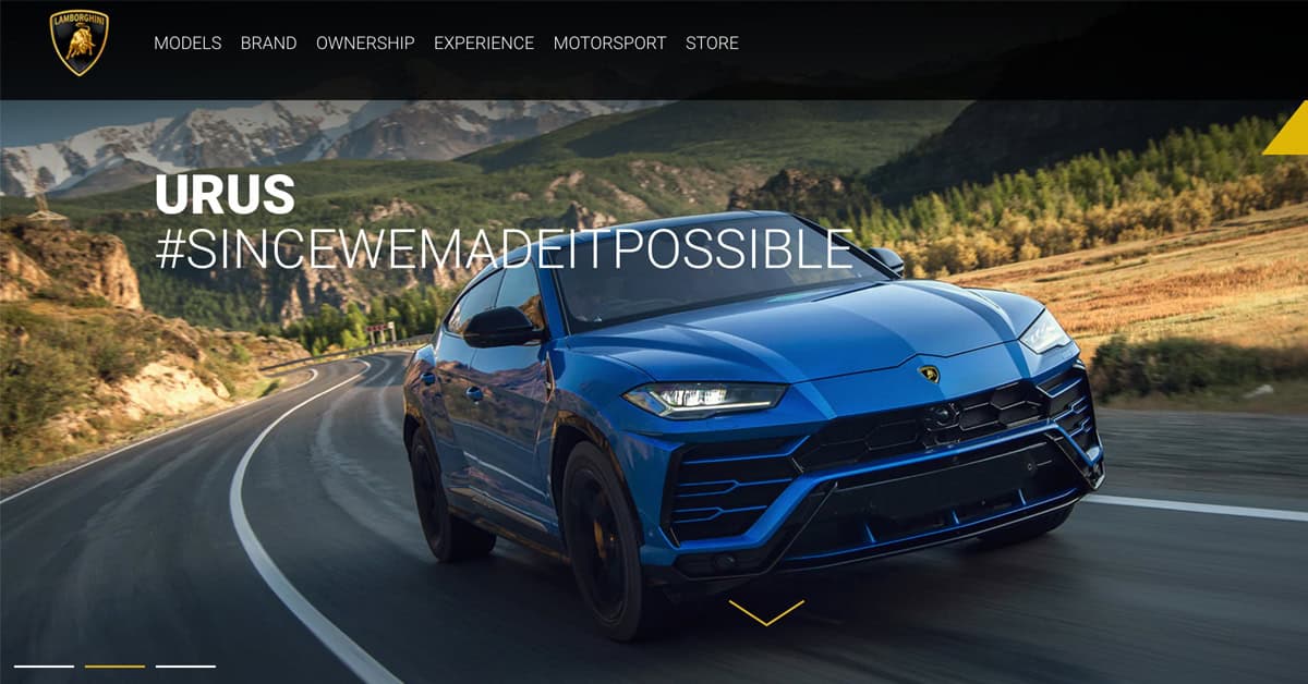
Lamborghini is an amazing example of a brand that has cleverly integrated responsive sliders into their website design with photography-heavy unique creatives. They surely do know how to convey their brand messaging!
 Source Link: https://www.lamborghini.com
With responsive sliders, your website visitors are also more in control of how they would like the information to appear and this ensures that they engage with your brand for a longer time. Moreover, incorporating responsive slides into your website design prioritises information and relates to your visitors’ needs, triggering the trust factor and resulting in increased conversion rates.
- Smart Videos
Videos has long been touted as a must-have for websites because of the power video has on the visitor. Motion, movement, and animations are guaranteed to keep a digital audience transfixed much more effectively than static elements.
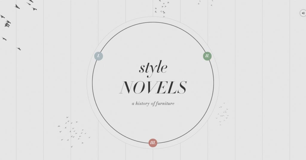
Style Novels is an innovative furniture website that incorporates an eye-catching video on their website design without being intrusive and jarring.
 Source Link: http://www.stylenovels.com
Unlike most furniture website that merely display their products with simple photos and descriptions and mainly using grids or card designs, Style Novels’s style incorporates a user-driven or a highly intuitive creative website design which enables visitors to explore different products according to their own needs.
-
Asymmetrical Layouts
If you start analysing the best website layout examples, you’ll notice that certain websites are designed based on the goals it wants to convey. Asymmetrical website design layouts aim to break design stereotypes and showcase new colourful ideas, surprisingly engaging elements and a fun arrangements of images, gifs, videos.
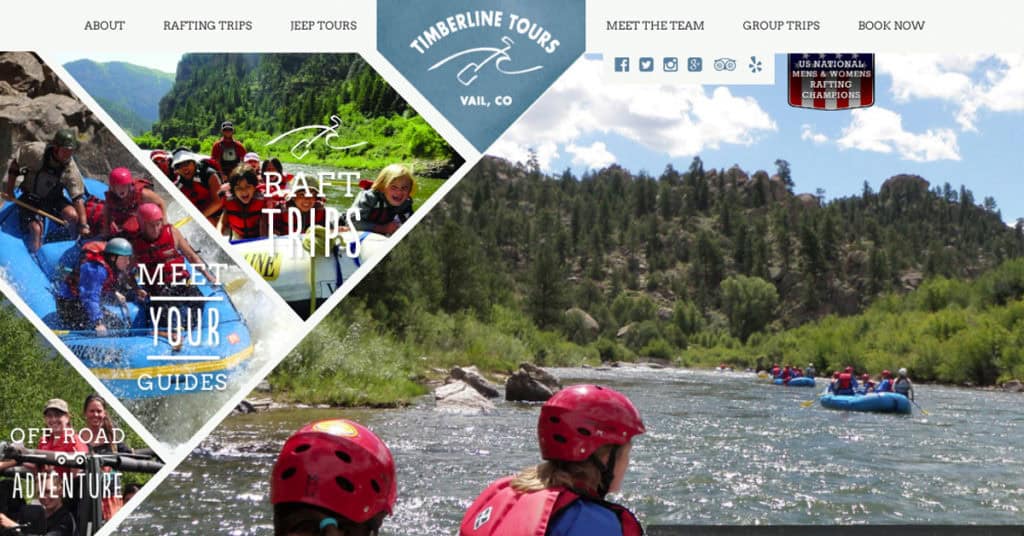
Timberline Tours is a great example of a website that highlights the fun activities and services offered in an instantly captivating asymmetrical layout.
 Source Link: https://timberlinetours.com/
In addition to featuring an offbeat image-based menu that neatly breaks the mould of picturesque main page, the navigation has a triangle form that perfectly recreates a balanced look even without symmetry while cooperating with a dynamic background that clearly sharpens a sense of motion with visitors.
-
Chatbot Integrations
Gone are the days where brands that affix chatbot applications on their website design wait for visitors to initiate conversations regarding customer support, queries, and feedback. Chatbot applications are now designed so that the moment your website visitors land on the website, the first thing they would be greeted with is a user experience chatbot!
Buddy Nutritions is a brand that’s revolutionised the chatbot website design idea to boost their business on another level and get quick conversions.
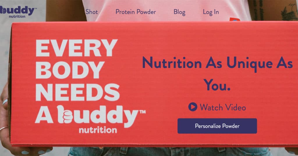 Source Link: https://www.buddynutrition.com/
Buddy Nutritions sells highly personalised vitamin “shots” that factor details like age, weight, level of activity, the goal you want to achieve as well as what flavours you like. So, without knowing quite a bit about you, they can’t sell you anything.
To avoid lengthy online forms or direct support from sales or customer service agents, the brand designed a conversational bot that asks the visitor specific question in a one-on-one enquiry. That’s not all. To give you an idea of how many more questions await you, the virtual bottle on the questionnaire fills out the closer you get to the end!
So there you have it! Our 5 best interactive website design examples that wisely and creatively use interactive/animated elements to give visitors a memorable and interesting experience.
In 2020, we expect to see more bold, intelligent, and eye-catching websites that use animation and video to enhance the user experience and improve the website design aesthetics while taking advantage of the top web design trends. Best part of all, get the assurance that good website design reaps returns for your business! Get an experienced digital agency to do the job, and you’ll see the benefits through higher sales conversions.

