With almost half the world in lockdown to contain the COVID-19 spread, various brands have been quick to react — whether it’s through updating of their website design or launching a new creative campaign. As a creative agency in Singapore, we too have been adapting ourselves to the Circuit Breaker measures and doing WFH while still offering creative services to all our clients.
Despite working from home, we kept our fingers on the pulse and are always on the lookout for exceptional campaigns and good web designs. While brands were adapting to the situation quickly, not all of them were doing it well, especially when it came to their website.
To provide some inspiration for any brands out there looking to start on their website development or switch out their landing banners, we’ve scoured the Internet and found 5 of the best COVID-19 web design banners that you should definitely learn from:
Google Gets Interactive & Appreciative
Being the most used website in the world, Google has huge volumes of users entering their site in both Singapore and around the world given their status as the unquestionable top search engine in the past decade.
So, it speaks volume when they put in the effort into their banners during this difficult time. Even more so when they do something like this to show their appreciation for the behind-the-scenes heroes of the pandemic aka the shipping, packaging and delivery employees:

(Taken from Google)
With a simple GIF and playing with their logo, they exemplified their gratitude to these workers through an animated visual of with the ‘G’ in their name representing delivery recipient giving hearts to the ‘e’ in their name, representing the employees.
Inspiration: If you’ve got the time, using animated visuals or short GIFs are a great way to improve the key message you wish to tell your audience. Be it a message of encouragement, unity or letting them the change in your operations, it’s a pretty cute option to try out.
Razer Keeps It Sharp
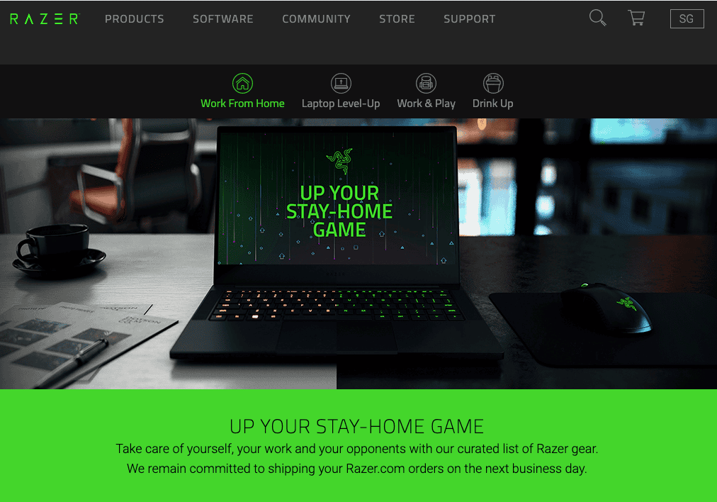
(Taken from Razer)
As a brand that is perfect for the #StayHome trend, local pride Razer didn’t waste any time in upping their game by telling their customers to up their Stay-Home game with their products and assured quality.
With a sharp and clean photography-based banner that uses their brand colours, black and neon green, perfectly, this #StayHome banner inspired the gamers in all of us to improve our set-up with some Razer equipment for work and for play and reinforce brand identity.
We particularly appreciate the copy in their banner, ‘Take care of yourself, your work and your opponents’, accentuates the quality of their products while their promise in providing fast delivery caps it all. Sure enough, a curated list of Razer products follows this banner to appeal to their customers, making it a rather user-friendly website design.
Inspiration: Nothing fancy here, just good use of brand colours and GREAT copywriting that grabs the attention of their community complemented with a great shot of their products. Put some thought into the copywriting in your web design.
IKEA Uses Emotional Appeal
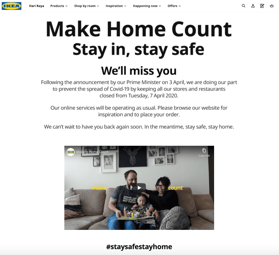
(Taken from IKEA)
IKEA is a brand that’s all about home and making living at home easier, which could be the reason why it was so natural for them to come up with a COVID-19 website banner that struck close to our hearts.
The message ‘Make home count. Stay in, stay safe’ hits all the right notes when paired with their moving video filled with typical memories of home, which really brings out the essence of what IKEA is all about.
Through emotional visual storytelling in their web design, IKEA used video, curated themes, products and emotional copies to not only get people to #StayHome but also provide their products and delivery services as a selling point.
Inspiration: Find a way to angle your products, services and brand with existing issues and trends in a meaningful or strategic way. You don’t always have to go witty or strategic, the emotional appeal works just as well!
M1 Takes Social Distancing Seriously
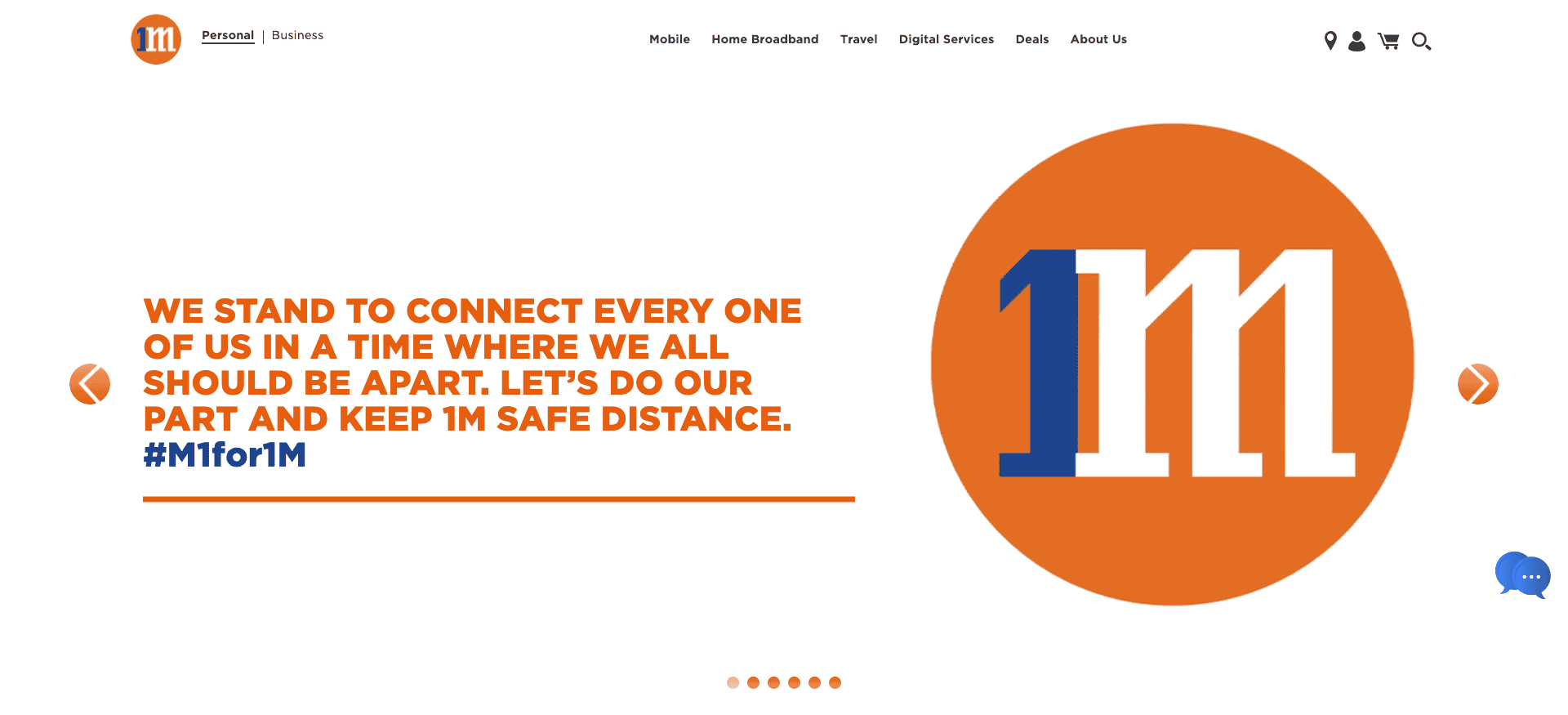
(Taken from M1)
Not many brands in Singapore took up the challenge of advocating for social distancing, even less when we talk about brands we went as far as tweaking their logos to do so. But local telecommunications brand M1 did.
In a creative yet meaningful twist, M1 announced in an animated video that they were switching up their logo to 1M, representing the minimal distance required to adhere to the social distancing laws. They went all out and tweaked their logo across the entirety of their website.
Using this in their banner, it was also paired with a message of solidarity and unity to go along with the new ‘1M’ logo.
Inspiration: Don’t be afraid to play with your brand, especially when it’s for something as meaningful and purposeful as this. You don’t have to revamp your entire brand, just fine adjustments are enough if it brings out the point. Feel free to approach a branding agency in Singapore to help you with this as well.
Marriott Inspires Hope
(Taken from Marriott)
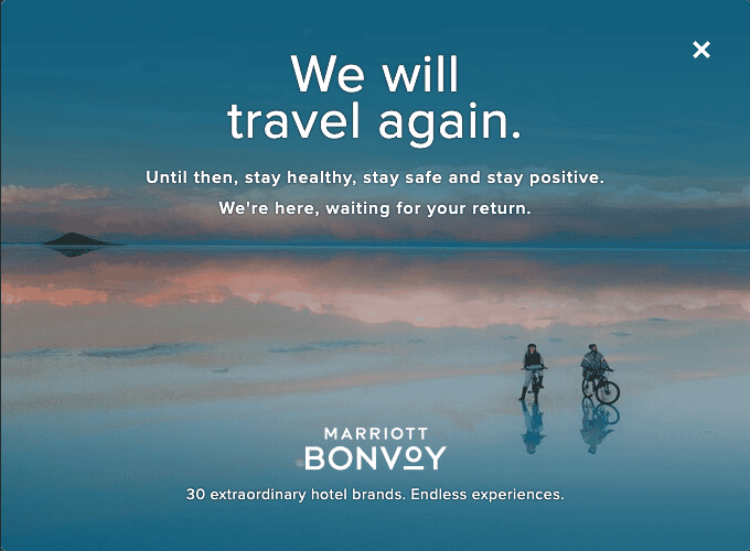
Tourism and hospitality was probably the industry that was hit the hardest because of this COVID-19 pandemic. But instead of wallowing in self-pity (not that we’ve seen any brands doing that), Marriott put up a pop-up banner with a message of hope.
For all the wanderlusters out there, these travel restrictions are difficult to endure but for the sake of our health and the loved ones around us, we need to. The hope remains at the end of the tunnel, which is aptly brought up by Marriott — ‘We will travel again.’
Employing a background that inspires travel to go with that message, Marriott reminds their customers that they will continue to be there, ‘waiting for your return’ as though asking everyone to stay positive and hopeful of the situation turning for the better.
Inspiration: A perfect blend of visuals and content in web design is particularly impactful with the right message in the right situation and this is one of those cases. Sometimes a great ambient image is enough to change the mood of your design.
A Full-Service Web Developer And Creative Agency
Branding and web design are both of our expertise, which is why if you’re looking to update your web design or come up with a branding campaign, we highly recommend that you give us a call. We’re always looking to help businesses, big or small, achieve their business objectives. Drop us a message today, our consultants are ready to take on your brand.
