Today’s beauty landscape has evolved tremendously as compared to what it was even just 5 years ago. Hence, it is why the beauty industry was valued at $532 billion (as of 2019) and counting. The rapid growth of this industry is also the reason that brands are constantly ramping up their efforts to stand out and be different. Chances are if you’re already in the beauty business, the ball’s in your court. The consumer base is perpetually growing in size with the online cosmetics market being projected to hit $675 billion by 2020. So the challenge here is to make more than just a compelling eCommerce website. Brands have to now look at creating a website that sells. Websites such as Colourpop, Glossier, Sephora, MAC Cosmetics, Milk Makeup, KRAVE Beauty and KKW Beauty do more than just create a stunning website. We take a closer look at what distinguishes these brands from the rest.
-
Glossier
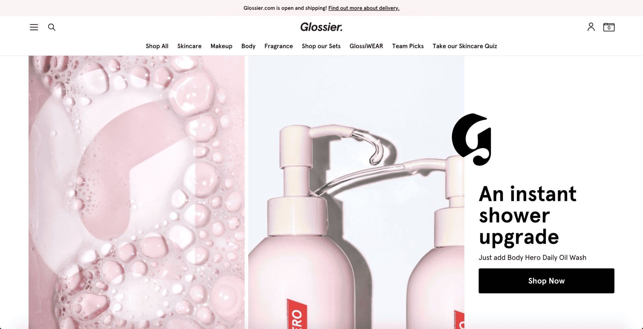
What started out as a beauty editorial website, Glossier is now a beauty company with its largest flagship store in New York City. Building on their motto where they make “Skincare & Beauty products Inspired By Real Life” — Glossier are the brains behind the internationally acclaimed gel-cream blush, Cloud Paint and conditioning face wash, Milky Jelly Cleanser. With the focus on their distinctive photography style, here’s how the brand employs a minimalistic usage of product photography on their website:
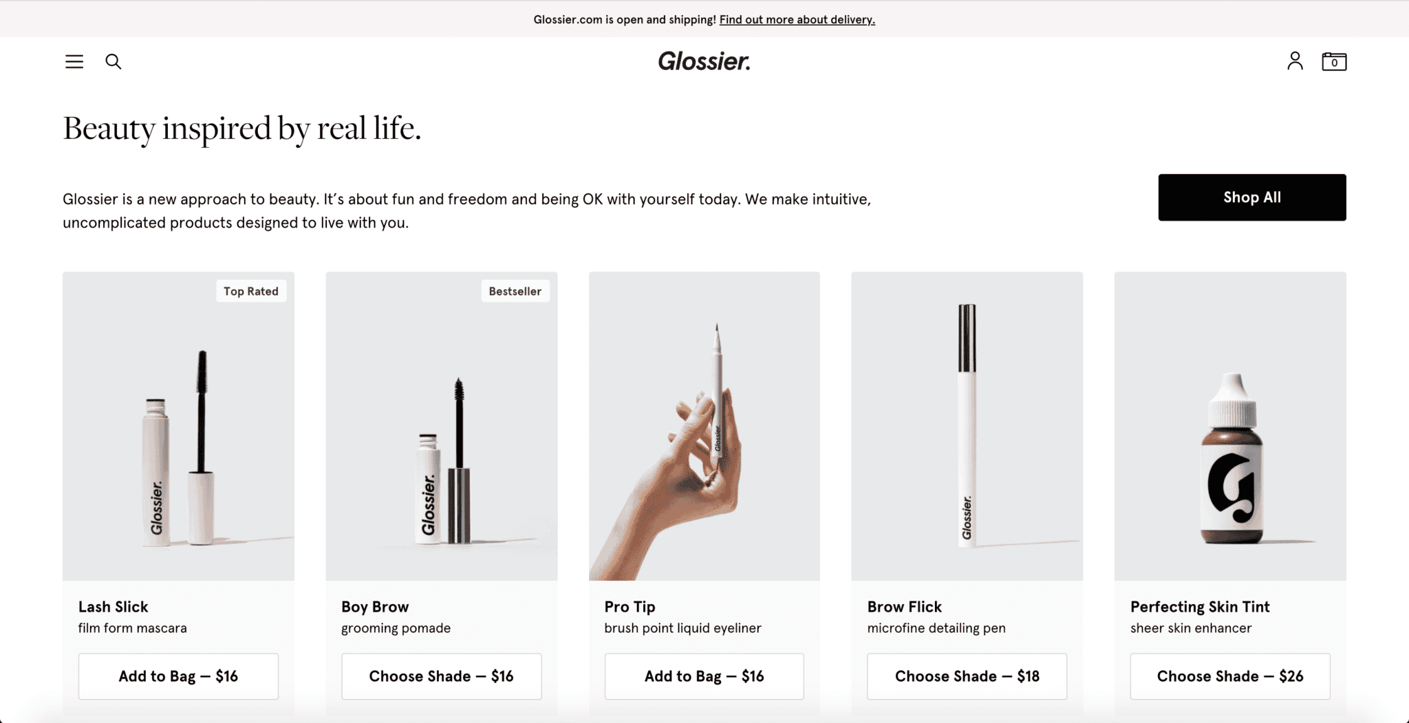
The Glossier product page might just be one of the cleanest product pages out there. With all the products shot against a white background and a hand model featured occasionally, this shows an effective usage of photography in their website design. Plus, this effortless yet modern look is well-paired with the same font employed throughout the entire eCommerce site. Not only is it easy on the eyes, but it also features the product in all its glory and allows it to speak for itself. Seeing is definitely believing.
-
Milk Makeup
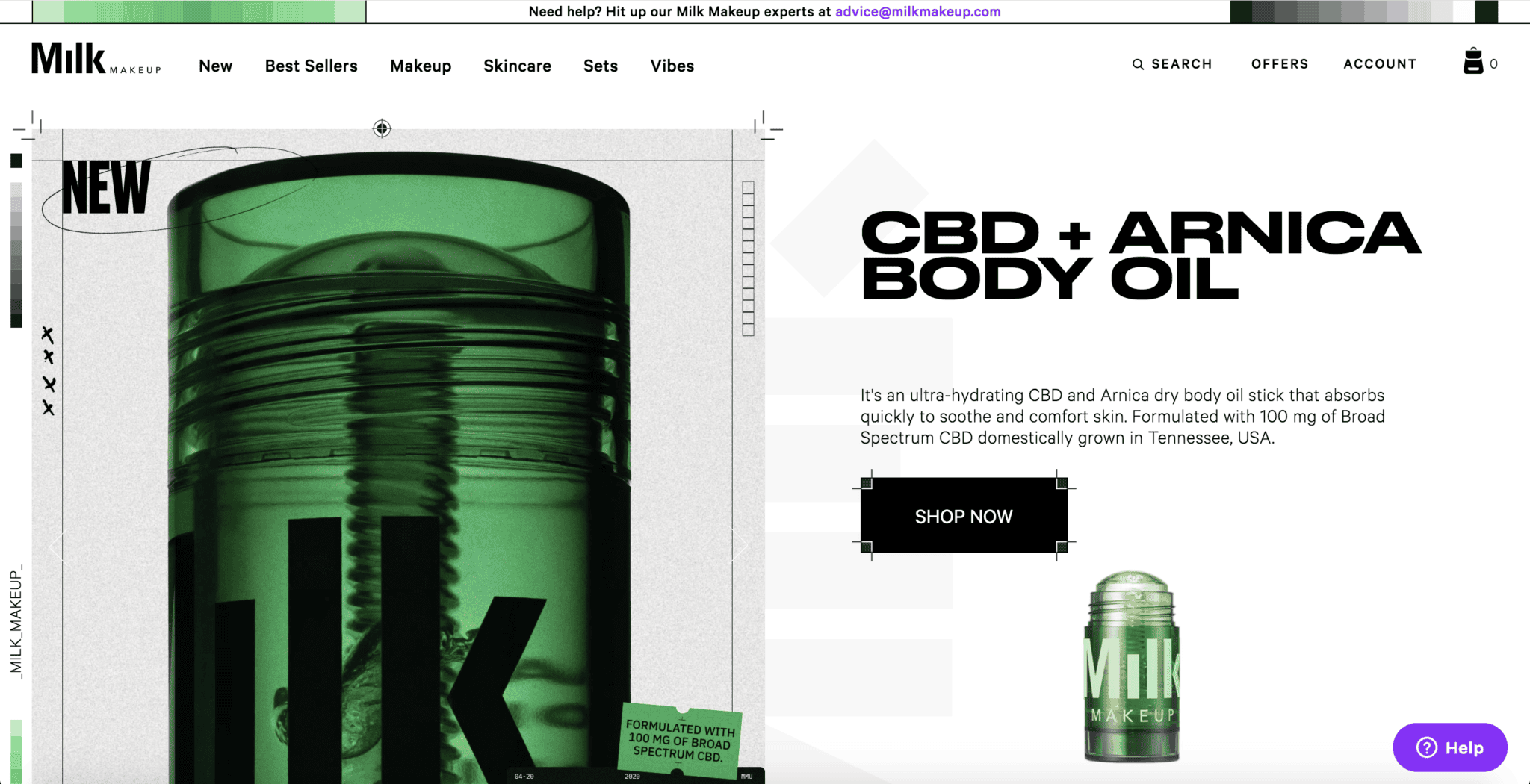
Being cruelty-free, paraben-free and 100% Vegan is what Milk Makeup prides itself on. The website boasts a bold usage of fonts and graphical design elements that are not common in the cosmetic scene. With a rather chic take on the website design, Milk Makeup cleverly highlights its products in a rather unconventional way. Observe the website’s unique footer design:

The line of icons separating the main page from its footer is actually a list of ingredients the brand has sworn to never use in their products or as they call it, the ‘Ingredient Blacklist’. In a world where consumers are increasingly more informed of their purchasing decisions, this design element reassures the masses of their ethical practices while adding an edgy touch to the entire website design. Designing for transparency and trust is definitely contributive to a loyal consumer base.
-
KKW Beauty
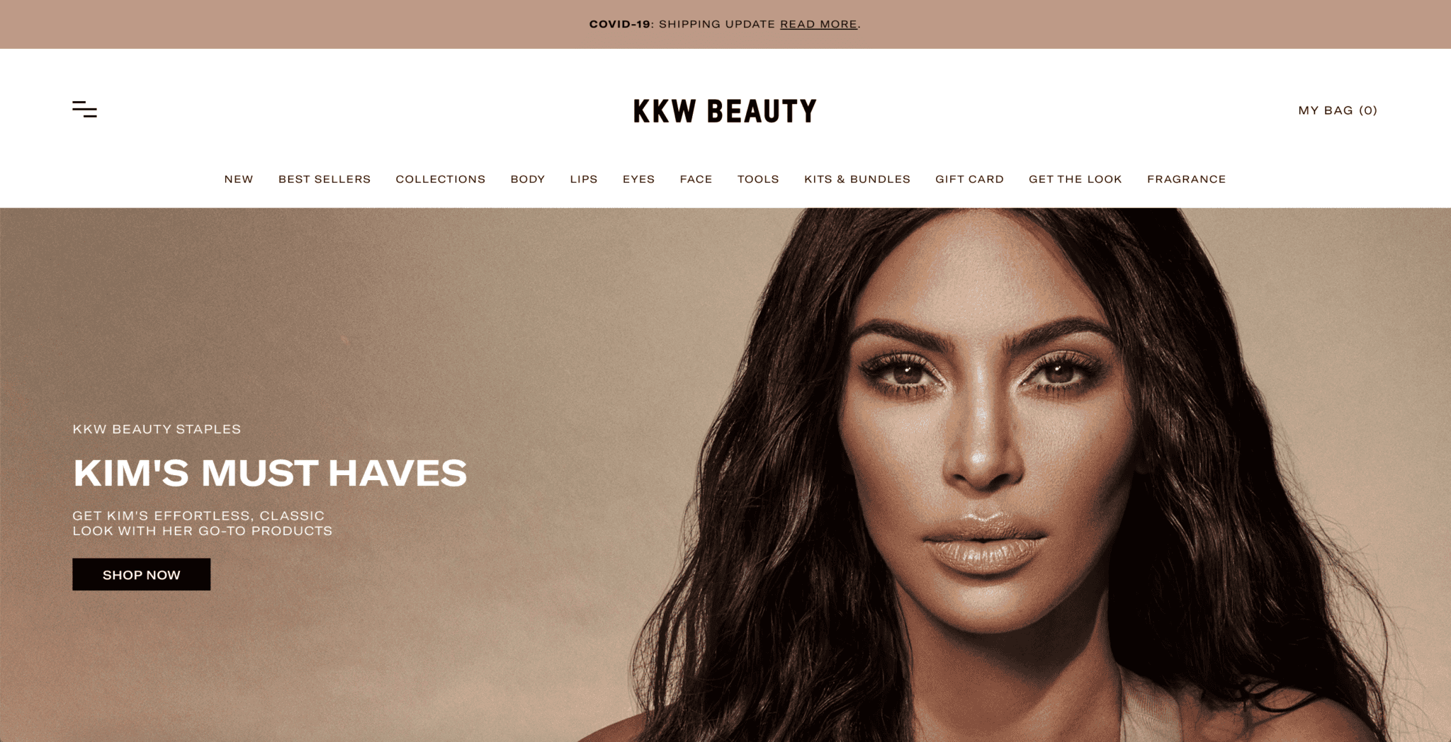
You and I both know her from Keeping Up With the Kardashians or as Kanye West’s wife — Kim Kardashian. But this American socialite and media personality is also a businesswoman of her own beauty line, KKW Beauty. From contour and highlight sticks to mascara and body shimmers, the website hosts a variety of products and even dedicates a page for fans to identify which products were used for specific looks spotted on Kim K. herself. Here’s how KKW Beauty uses a video within the homepage to highlight the brand’s best-seller, the Skin Perfecting Body Foundation:
Videos and Search Engine Optimisation (SEO) can go hand-in-hand. An underutilised tool in most SEO efforts videos not only increase your chances of higher conversion rates, but it can also boost your SEO rankings over time (as a result of higher sales). Plus, in a world where the attention span on the Internet is shortened, videos are a great way to retain your user’s interest.
-
Aesop
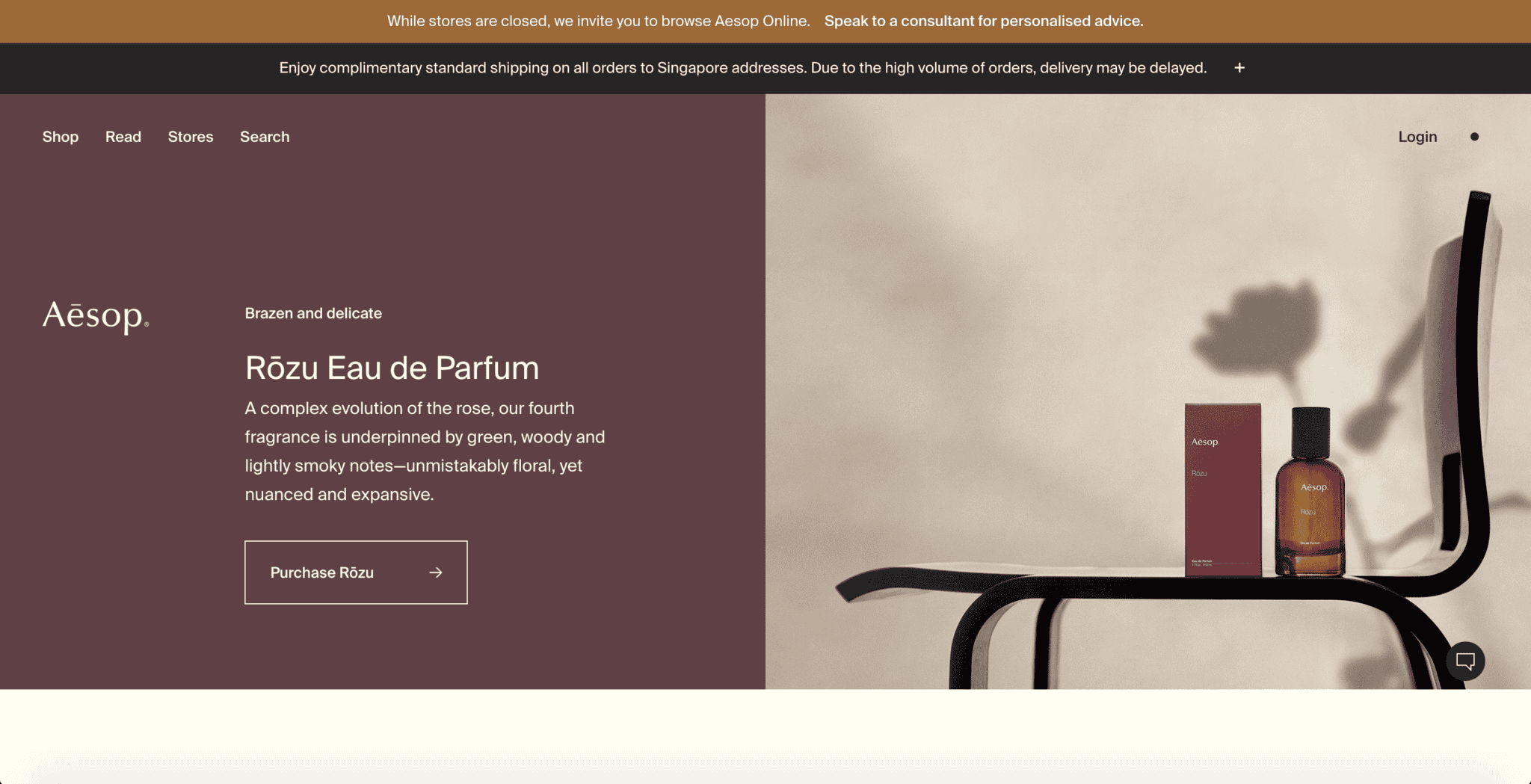
A mauve colour palette, minimal text and tactical usage of aesthetic photography – this is how Aesop Singapore aces its website design. Not only does Aesop’s products are amongst one of the best beauty products in Singapore, but this luxury skincare brand’s website is made of clean and sleek design. Here’s a further look into Aesop’s product page:
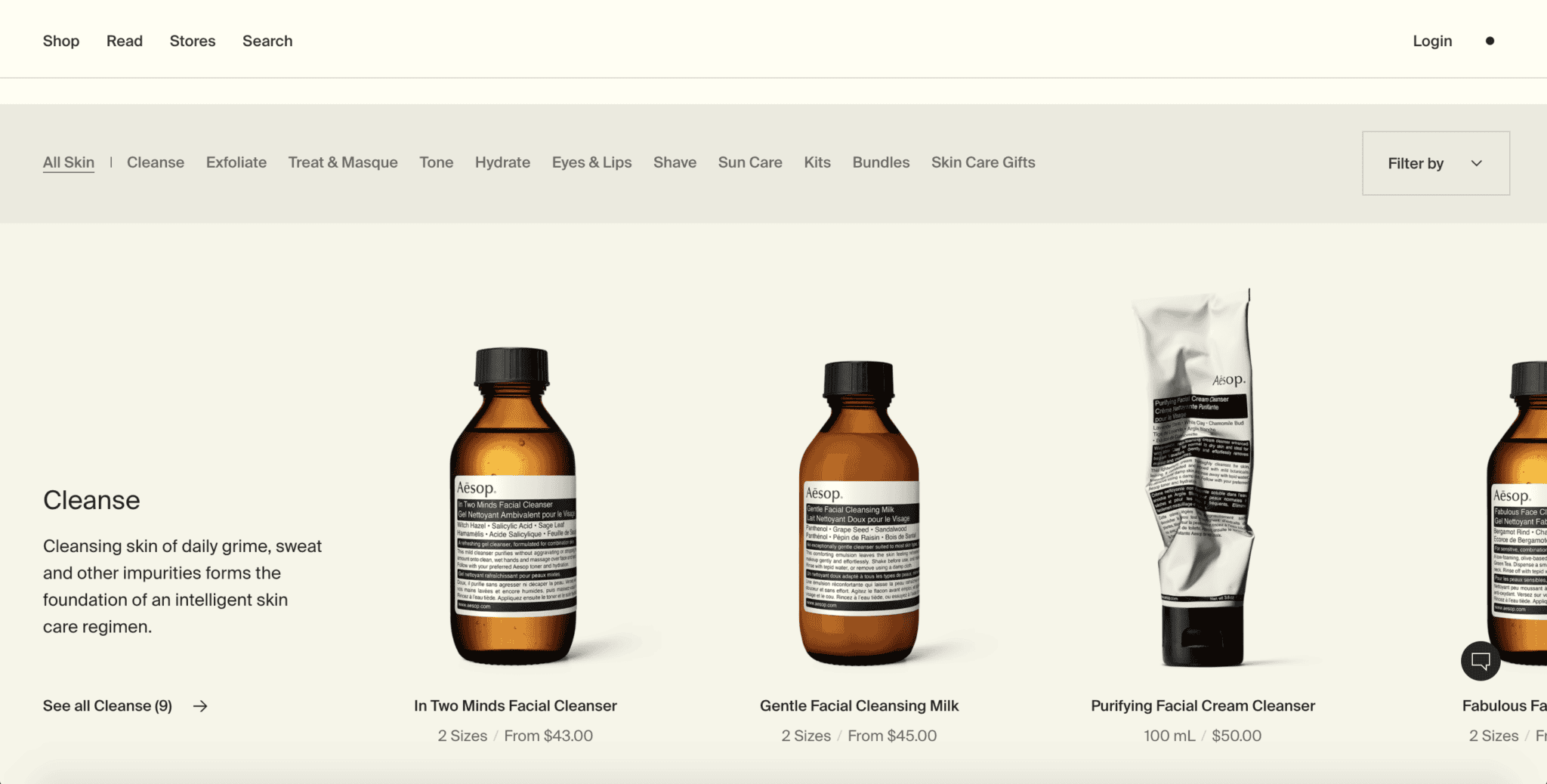
Instead of a regular top-down products page, Aesop displays its products left-to-right. In addition, these products are automatically grouped in the same category without the user having to filter the range displayed as well. This tactical usage of colour theory in website design and product categorisation is what differentiates their brand from the rest.
-
Colourpop
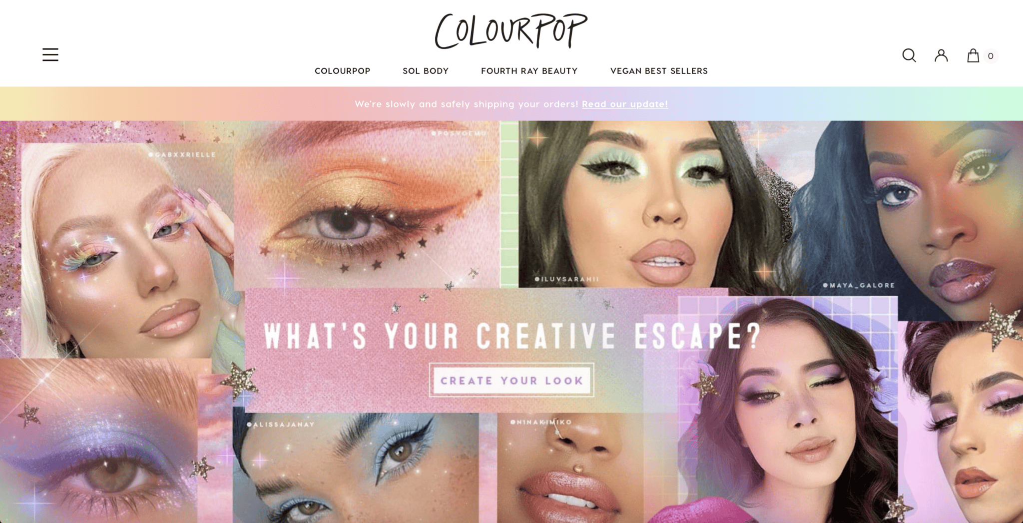
A highly influential and affordable makeup brand, Colourpop is just about any makeup-obsessed girl’s best friend. From eyeshadows to coloured eyeliners or stunning glitter eyeshadows, they’ve got everything you need for both makeup novices and experts. The Colourpop website is not only easy to navigate, but it also hosts amazing product photography that does their products justice:
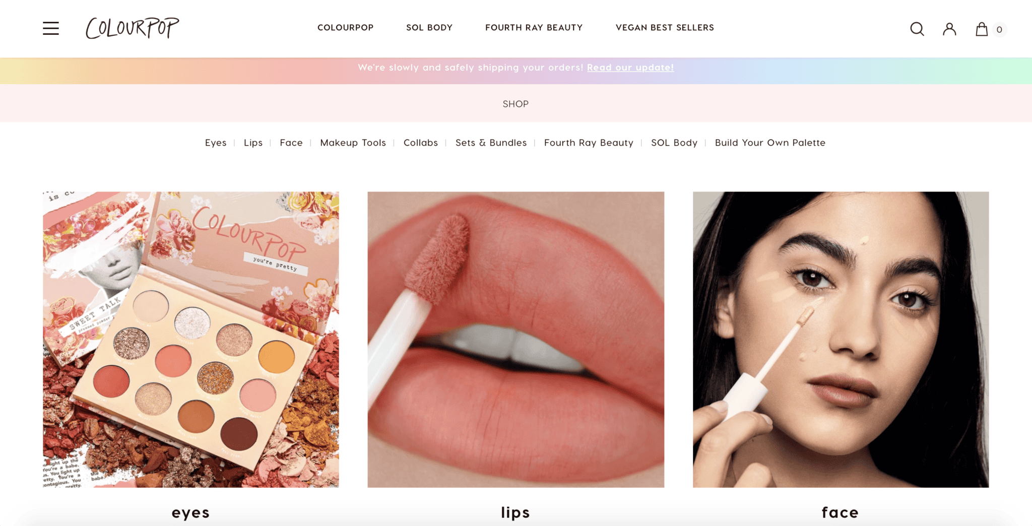
It can be extremely easy to get lost amongst the sea of products. Great categorisation and website navigation is what can help consumers not get confused and locate what they need. This can help to reduce the bounce rates and encourage higher conversion rates if consumers are not confused on your website.
-
MAC Cosmetics
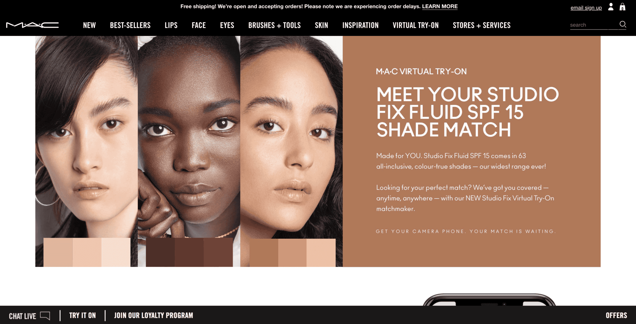
The big sister of the makeup industry — MAC Cosmetics is a makeup powerhouse that celebrates women of all colour. It is by now, almost essential for brands to be inclusive and MAC is here to stand for that. A distinctive feature that segregates this brand is the M.A.C. Virtual Try-On to determine your perfect foundation shade. Simply turn on your phone’s camera, click on the ‘Live camera’ setting and voila — your MAC foundation shade will be revealed to you. In today’s digital sphere where eCommerce websites are getting that are engaging and interactive, it is important for brands to stay afloat and relevant amidst all the upcoming trends.
-
KRAVE Beauty
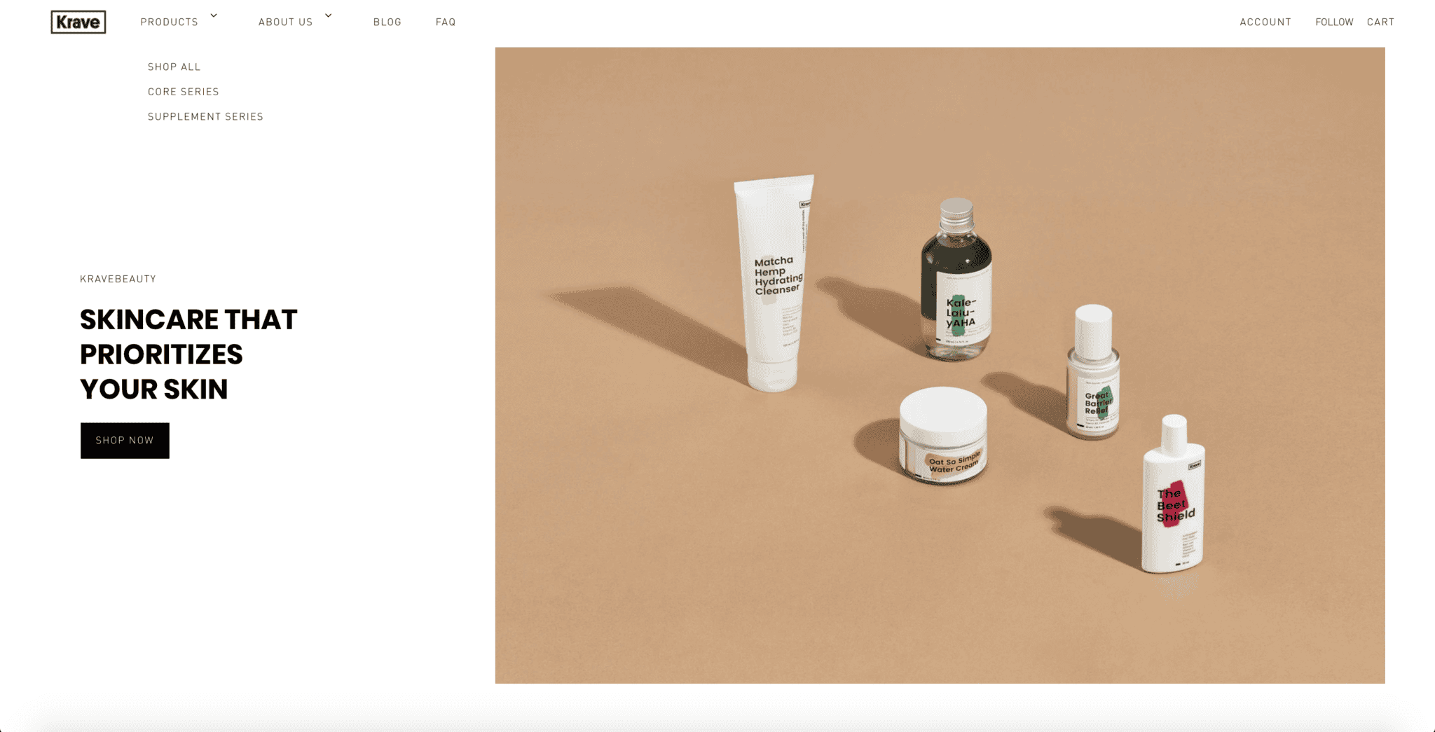
You might know this brand with one of the best skincare treatment solutions. Founded by Korean beauty influencer, Liah Yoo, this K-beauty brand took the world by storm when she released her skincare line named KRAVE Beauty in 2017. Aimed to streamline the complicated process of layering skincare, KRAVE advocates the notion that “Skincare should be easy”. With only 5 products at its core, this brand already has a following of over 159K followers on its Instagram page alone. Loved by many, KRAVE beauty’s websites is another minimalistic website that uses whitespace in its website design to its advantage. This negative space not only provides a more clean outlook, but it also ties in with their branding of keeping skincare to the basics.
-
Sephora Singapore
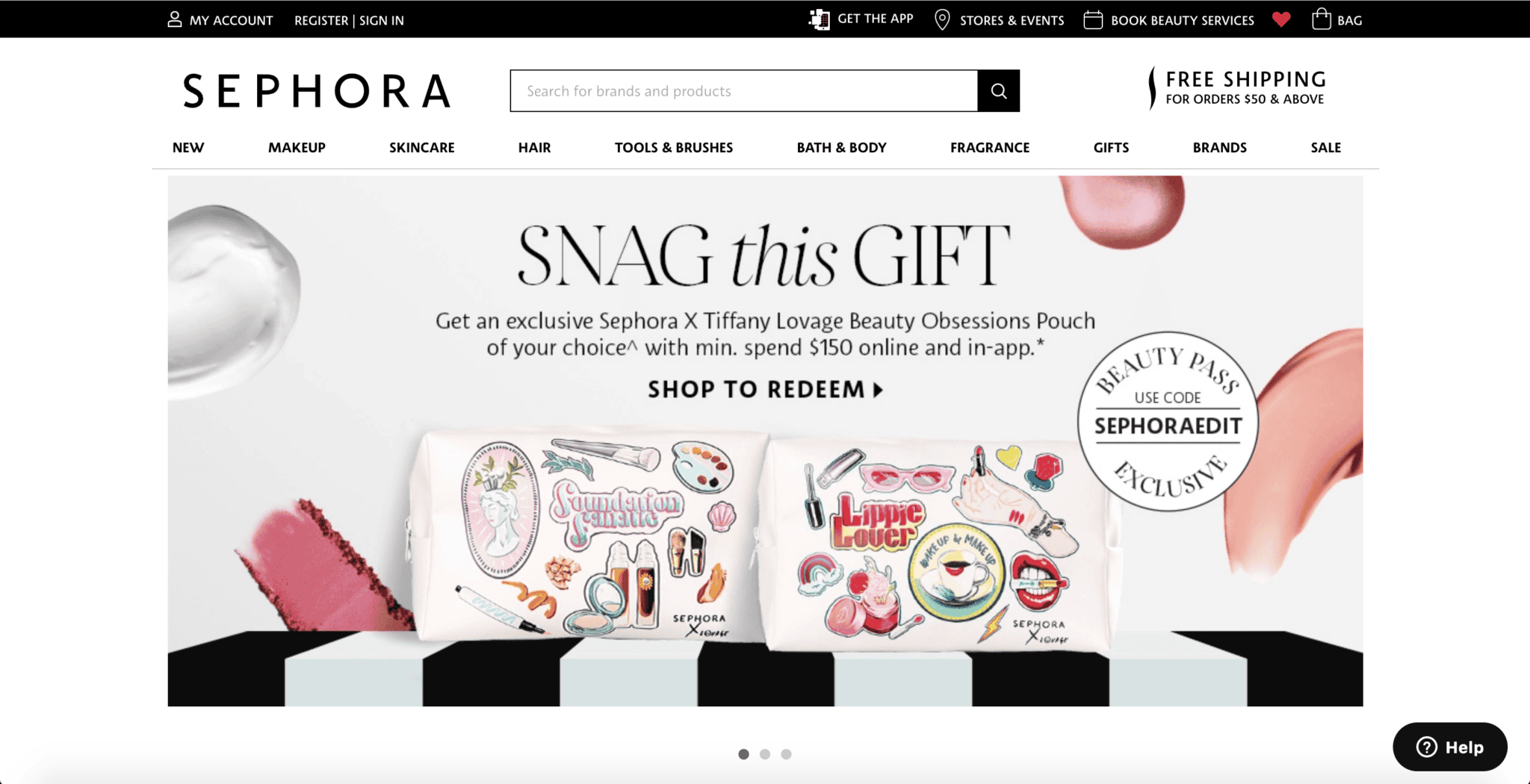
In a product-heavy website like Sephora Singapore, they do a pretty good job at segmenting the website yet tempt you into getting something you completely didn’t think you needed before this (speaking from experience, yes). At a snapshot, you’re able to identify all the necessary information that a user will need at the above-the-fold. This includes the navigation bar, the important call-to-action (CTA) buttons and the search bar. An effective website search bar can yield high conversion rates and this starts with tactful placement. There are multiple ways to go about designing the menu and search bar ideal for your brand. Engage an experienced web designer in Singapore to design an eCommerce site best suited to your brand’s needs.
The primary goal for any eCommerce website is to sell. With the beauty industry growing rapidly and design trends evolving constantly, the demand to meet consumers’ needs increases as well. If you’re looking to create an eCommerce website of your dreams, we could do the job just for you. Contact our sales team and we’ll get right back to you!
