For decades, the traditional brand style guide was a “bible” – a static, immutable document designed to enforce absolute uniformity. But in 2026, the digital landscape moves too fast for static rules. Enter the concept of brand fluidity.
While traditional branding focuses on consistency (appearing exactly the same everywhere), brand fluidity focuses on cohesion (feeling like the same entity while adapting to the medium). A fluid brand is like water: it adapts to its environment—whether a minimalist mobile app, a TikTok video, or a pop-up store – without losing its essence.
Traditional vs. Fluid Branding: A Comparison
| Traditional Branding | Brand Fluidity | |
| Primary Goal | Replication and control. | Adaptability and resonance. |
| Logo Usage | One or two fixed versions. | Responsive logos that scale in complexity based on size. |
| Visuals | Strict, repetitive patterns. | A dynamic “kit of parts” (shapes, textures, motions). |
| User Experience | Static and predictable. | Context-aware and interactive. |
The risk of a purely fluid approach is “brand dilution,” where the identity becomes so adaptable it becomes unrecognisable. To prevent this, you need a style guide that doesn’t just sit on a shelf – it needs to be a functional tool that guides this evolution.
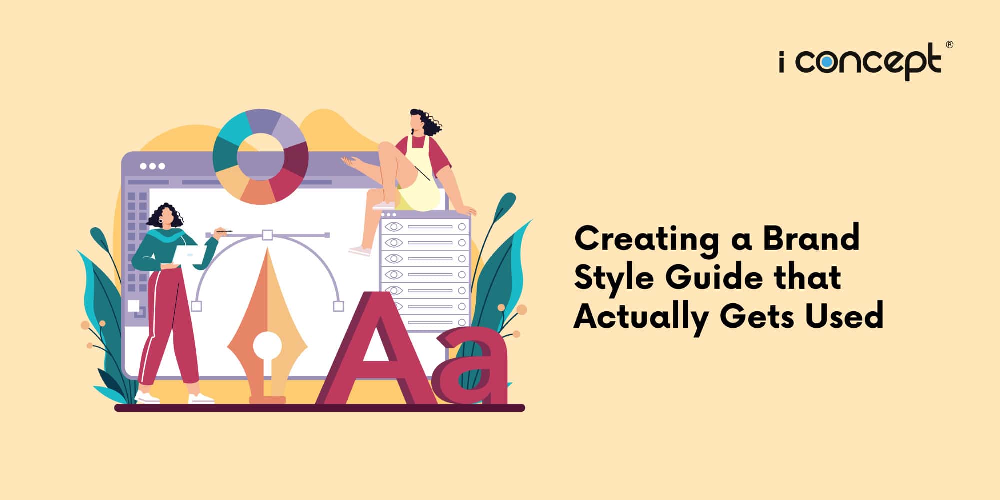
However, many businesses fall into a common trap: they invest heavily in a stunning visual identity, only to have the resulting brand style guide sit in a digital “junk drawer,” gathering virtual dust.
Research suggests this isn’t just a minor oversight—it’s a significant drain on potential revenue. According to recent 2025/2026 branding data, companies that maintain consistent brand presentation across all touchpoints see a revenue increase of 23% to 33%. Conversely, a staggering 77% of brands admit to occasionally publishing off-brand content, often because their guidelines are too complex, inaccessible, or purely theoretical.
To build a brand framework that your team actually uses, you must move beyond a simple PDF of logos and colours. You need a living document that empowers every stakeholder – from the intern to the CEO – to be a brand guardian.
1. Start with the “Why”
A style guide that only lists hex codes is a technical manual, not a brand manifesto. To inspire genuine adoption across a department, you must first document the “soul” of the company. In 2026, market data reveals that 81% of consumers need to trust a brand before making a purchase.
How do we garner said trust? The answer: emotional consistency, which begins with a clearly articulated brand purpose.
Move beyond hollow buzzwords like “Innovative” or “Reliable.” A high-utility guide defines what these look like in action. For example, if “Transparency” is a core value, your guide should specify that pricing is always displayed upfront without hidden fees. This transforms abstract concepts into actionable standards for your sales and marketing teams.
Humanise your brand to make it relatable for staff. If your brand walked into a room, what would they be wearing? How would they greet a stranger? By defining a Brand Personality, you provide a psychological blueprint. A “Sophisticated Architect” brand uses different visual spacing and vocabulary than a “Playful Sidekick” brand. This helps staff maintain the “vibe” across every touchpoint, from LinkedIn posts to physical storefronts.
2. Master the Art of Digital Copywriting
Visuals may grab attention, but words drive conversion. Digital copywriting serves as the conversational bridge between a brand and its audience. A functional style guide must treat text with the same rigour as typography.
It is vital to define the nuance between these two. Your voice (the brand’s inherent personality) should remain constant, while your tone (the emotional inflection) must adapt to the user’s journey. Your guide should provide a “Tone Spectrum”: perhaps a “Supportive Helper” tone for a 404 error page to reduce user frustration, shifting to an “Excited Cheerleader” for a checkout success page to reinforce a positive purchase decision.
Inconsistency in writing signals a lack of attention to detail. Your guide must settle the debates: Do you use the Oxford comma? Since we are operating in Singapore, do you strictly adhere to British English (e.g., colour instead of color)? Standardising these “micro-copy” elements prevents a disjointed user experience and ensures your brand sounds like a single, coherent entity across global markets.
3. Design for Real-World Utility
The primary reason brand guidelines are abandoned is a lack of practical, “in-the-wild” examples. Instead of showcasing a logo design for the company in a vacuum on a white background, your guide must demonstrate its application in the chaos of the real world.
Often more important than showing how to use a logo is showing how not to use it. Explicitly illustrate “Brand Sins” – such as stretching the aspect ratio, placing a thin logo over a busy photographic background, or using unapproved colour gradients. Providing these negative constraints empowers non-designers to make safe choices.
In 2026, inclusive design is a legal and ethical imperative. A “used” style guide includes AAA-compliant colour pairings for web interfaces. Provide a “Cheat Sheet” of which text colours are legible against which brand backgrounds. This ensures your ecommerce development is accessible to the 2.2 billion people globally with vision impairment, directly impacting your site’s SEO and bounce rates.
4. Case Study: The ROI of Cohesion
The impact of a living style guide is most visible in the competitive world of ecommerce development. Look at the trajectory of successful Singaporean brands that prioritised brand “fluency.”
A local beauty brand, SG Beauty Essentials, recently demonstrated that by tightening their visual excellence and storytelling consistency, they achieved 300% follower growth and a 78% increase in sales. This success wasn’t the result of a one-off campaign, but rather the rigorous application of a unified style guide across every digital ad, product description, and email. When every touchpoint reinforces the same brand promise, the “Path to Purchase” becomes significantly shorter. In contrast, businesses with fragmented branding often see customer acquisition costs (CAC) rise as they struggle to build the brand recall necessary for organic growth.
Moving from Manuals to Momentum with I Concept Singapore
Establishing your company’s branding in Singapore, and ensuring that it is able to stand the test of time requires more than just a creative eye; it requires a strategic partner who understands the local landscape. I Concept Singapore is a leading integrated creative agency that bridges the gap between high-level strategy and daily execution.
As a premier creative agency, we don’t just hand over a PDF. We build comprehensive brand ecosystems. Our expertise spans from the initial logo design for the company to the intricacies of digital copywriting and marketing and large-scale ecommerce development. We understand that for Singaporean SMEs, growth and efficiency are paramount.
Leveraging Government Support for Your Brand
In line with Singapore’s commitment to business transformation, our services are often aligned with available government grants:
- (EDG): This grant can support projects under “Strategic Brand and Marketing Development,” helping you subsidise the cost of professional brand consultancy.
- (PSG): For businesses looking to pivot or scale, we offer pre-approved solutions for ecommerce development and digital marketing, allowing you to claim up to 50% of eligible costs.
At I Concept Singapore, we believe a brand is a promise kept. Whether you are looking to refresh your identity or build a new digital storefront, our team is ready to ensure your brand style guide isn’t just a document, but a driver for your business growth.
Have a conversation with us today and discover how I Concept Singapore helps you blend your branding in Singapore with technical excellence, taking your visual identity and your brand to higher heights of relatability.