We’re way past the stage where being “mobile-friendly” is actually enough. It’s time to put your mobile users’ needs first. It’s time to think “mobile first”.
But what does that mean, exactly? How should your digital solutions, your websites, content and content strategy change to align itself with a mobile first mindset?
More than just improving mobile responsiveness or resizing web pages, being mobile-friendly is all about optimising. Optimising your overall web content for the mobile world. Be it text, videos, slideshows or other assets, you must optimise them in a way that provides value to your content marketing strategy and target audience.
We at I Concept, your creative design agency, are here to share steps to make your content mobile-friendly, be it for e-commerce development or website design. Plus, we’ll throw in notes on what to spot and all you need to know about being mobile-friendly.
Make it snappy and promptly workable
Speed matters online. It’s often a top consideration in website development. And on mobile, it matters even more. According to a research from Google, some 53% of mobile site visitors leave a page that takes longer than three seconds to load.
And yet, according to that same research, the average time it takes to fully load a mobile landing page is 22 seconds. Clearly, there is a problem.
What needs to be done is to speed up your site enough to get it to load for mobile users in 3 seconds or less, so as to beat your competitors. And that will lead to more website traffic, more leads and more sales.
Next, you need to make sure that your site is “responsive”. Being responsive, in tech-talk, is to be able to respond (and cleverly adapt) to whichever devices the content is read on. And that leads us to the 3 key things you need to do with all your content, design and set up, and that is to optimise them all.
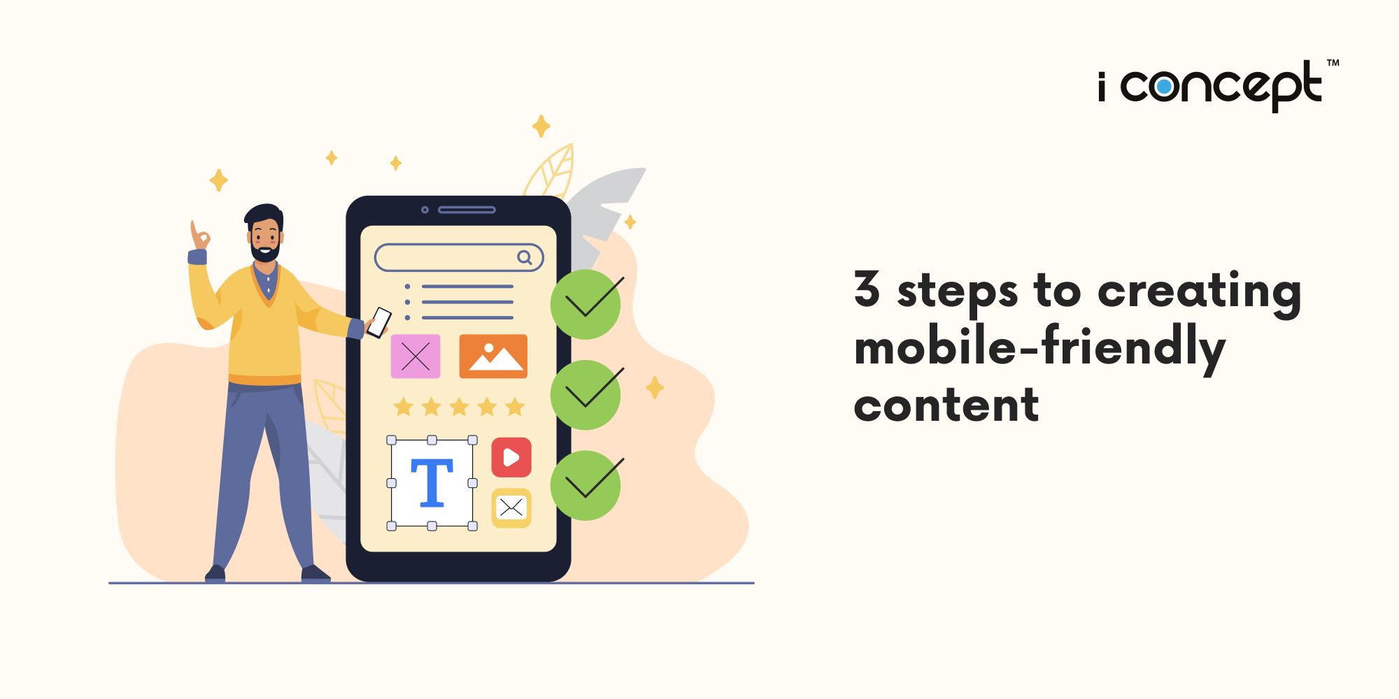
Three key steps to being mobile friendly: It’s all about optimising
- Optimising text
Understanding the reading patterns of people is the foremost aspect in making content mobile-friendly. There is a fundamental difference in terms of mobile reading and desktop reading, in terms of content marketing and good digital copywriting.
Based on research and trials, desktop readers follow what is known as the Golden Triangle pattern of reading. When people search for something on the Internet, they tend to see the top left corner of the search engine results page or the website. This resulted from eye-tracking studies that found that the majority of eye movements follow a triangular pattern.
For mobile, as the screen size is much lesser, an F-shaped reading pattern is considered the norm. People study the first line of the webpage, and they go down to spot for key information in the remaining lines if it interests them, and continue reading in detail if the content engages appropriately.
Therefore, it is important to fit your content to the F-shaped pattern, with the following points to note with regards to copywriting:
Headline: The source to attract your audience. Keep it short, noting the mobile screen limit for visibility. Headlines with six words have the highest click-through rates.
Summary: Provide an overview right at the beginning of the article to grasp the audience’s attention from their first view of the page, to ensure that the audience doesn’t miss important information you want to tell them in the article.
Body: Differentiating (chunking or grouping) the mobile content makes it easier to consume and is one of the best practices to follow. When you differentiate a group of content with different images and titles, it will be easier for a mobile interface user.
Be short and sweet:
More precise and brief copywriting are always excellent for a mobile interface, as too many long sentences and phrases will not impact the audience well, and they will lose interest and leave the website or page. Keep to shorter sentences and smaller paragraphs to significantly improve the quality of content and experience for a user.
- Optimising images and videos
Yes, videos and images, or chunked content examples, are great to attract the attention of mobile device users. And these include screenshots, graphics, memes and more, that add a visual punch to your content that keeps users interested.
But, there’s a catch: your images and videos must be optimised for mobile. Otherwise, they could take up too much digital real estate, or become illegible.
Load times are one of the biggest deciding factors for users engaging with your content or bouncing back to the search results. You need users to see your content quickly, and slow load times are detrimental to this cause.
For images, choose to use compression, which allows you to make your large files smaller without compromising appearance. Alternatively, create pre-optimised images (there are tools available online to help with this). Run your content (including images) through a preview process, and use your mobile device to check and see if you have enough white space to keep content readable.
For videos, optimising runs on two parts. First, create readable text, make sure the text in your videos is readable on mobile devices. Make sure you have a transcript of the video ready for those who prefer to read versus watching it. This will help you increase the SEO (search engine optimisation) value of your page. Also note that many users play videos without turning on sound, so make sure your video makes sense with the volume down.
Next, optimise your tech. By embedding third-party video hosting services (like YouTube or Vimeo) on your site, you can ensure bitrates, compression and more have already been optimised. If you choose to host your own video, invest in a tool that helps make everything fitted for mobile as well.
An important part of the process is to imagine yourself as the end user. Would you want to read and view most of the content and images on the page on your mobile divide? And do the visuals have a clear purpose? Do you feel comfortable with the experience of viewing everything in the mobile format? If it’s a yes for all, then your images and videos should be considered well-optimised.
- Optimising design
And then comes the big frame that is the design. It’s an integral part of all digital solutions. It’s key to both website development and e-commerce development. But what really constitutes design? Is good digital copywriting and visuals optimisation not already enough?
Here are some steps on the technical side of things for your website design, in terms of UI/UX design (user interface and user experience design), to ensure that your mobile content works.
Responsive design
As mentioned earlier, but what does it really mean? Some marketers incorrectly equate mobile website design with responsive design; but they are not exactly the same. Responsive design should be used across all digital solution platforms. It means that as screen sizes change, your content changes to fit within them. From smartphones, to plus sized phones, through to tablets.
Use less sidebars
Or useless sidebars. On desktop, sidebars can be a great way to facilitate the buyer’s journey and improve the user experience. On mobile devices, however, they’re simply a distraction. It usually gets pushed down to the bottom of the page and is rarely used.
So, unless you can create a fancy sidebar (like what Google did), it’s probably better to remove it altogether for mobile users.
Navigation menus and other elements on your desktop website design may also need to meet the same fate. Most importantly, try your site out for yourself and see what’s valuable and what needs to go.
Accelerated Mobile Pages (AMP)
Though they haven’t been heavily-tested or as widely adopted, AMP pages may help you get ahead of the mobile marketing curve. These HTML pages follow a specific format and were developed (once again) by Google and their partner brands. These pages get priority in the search results page of mobile users for certain relevant queries.
Optimise right with I Concept Singapore
Looking for help to get your brand’s website design or e-commerce development suited for both desktop and mobile? Or seeking other digital solutions and creative marketing tools that are fitted for mobile use? With our wide range of experience across channels, I Concept is ready to assist you!.
As a leading creative design agency Singapore, we offer diverse digital solutions, from website design and e-commerce development, to comprehensive digital marketing strategy advice. Our team of professional UX designers, programmers and creative copywriters are ready to help you get your content optimised. Speak with us today!


