If you’re in the logistics sector and your boss just asked you how to survive the pandemic and the near future, this article is for you. Hi Singpost and Ninjavan, do you happen to need any help? Hehe. In this article, we’ll tell you all about website design tips like refining your site navigation, using visual hierarchy to direct attention and useful website design features like chatbots, shipping calculators and a tracking system which are of a benefit to those in the logistics industry. These tips will help, be it revamping your old website or adding on features to your existing site. With the top priority being able to cope with eCommerce amidst COVID-19 and greater online demand, these tips will also help to futureproof your website. Also, if you have an existing site, you can include these tips to make your website user-friendly, easier to navigate and in general, engaging.
Let’s get to it!
Navigation
Navigating your site shouldn’t be as hard as walking in the forest at night. It should be intuitive with signposts, CTA buttons and copy to help users get where they want to go in as few clicks as possible. Plan your website navigation as if you were going to a country and what are the most popular spots you want to visit first. Taking that example further, the categories of things you want to do essentially become your sitemap. Translating it further, your navigation menu can consist of actions like do I want to learn more, buy now, track my package or ask a question. Another example would be having the section titled “Shipping costs” which can be broken into tiers by weight or location. One site with great navigation would be Love, Bonito where everything is clearly laid out and easy to view/search for.
Visual hierarchy – size and scale
Visual hierarchy is often defined as the arrangement or presentation of web elements in a way that implies the importance of it to the user. There are a few key pillars that revolve around visual hierarchy but for the logistics sector, we’re going with size and scale.
Manipulating the size and scale of certain elements can help to draw attention to Call-to-Action buttons, images and even text. This is especially useful when you want users to send you a message, ask for a quotation or even get them to check prices for your services. Making a button large can subconsciously entice users to click on it as well.
Size and scale can also apply to text. Having a short one-liner introduction on your home page can make a big impact on visitors, leaving them with a lasting impression. A primarily home moving service, GetVan.sg site makes use of this principle to emphasise on their 4 key services!
Functional features – shipment tracking system
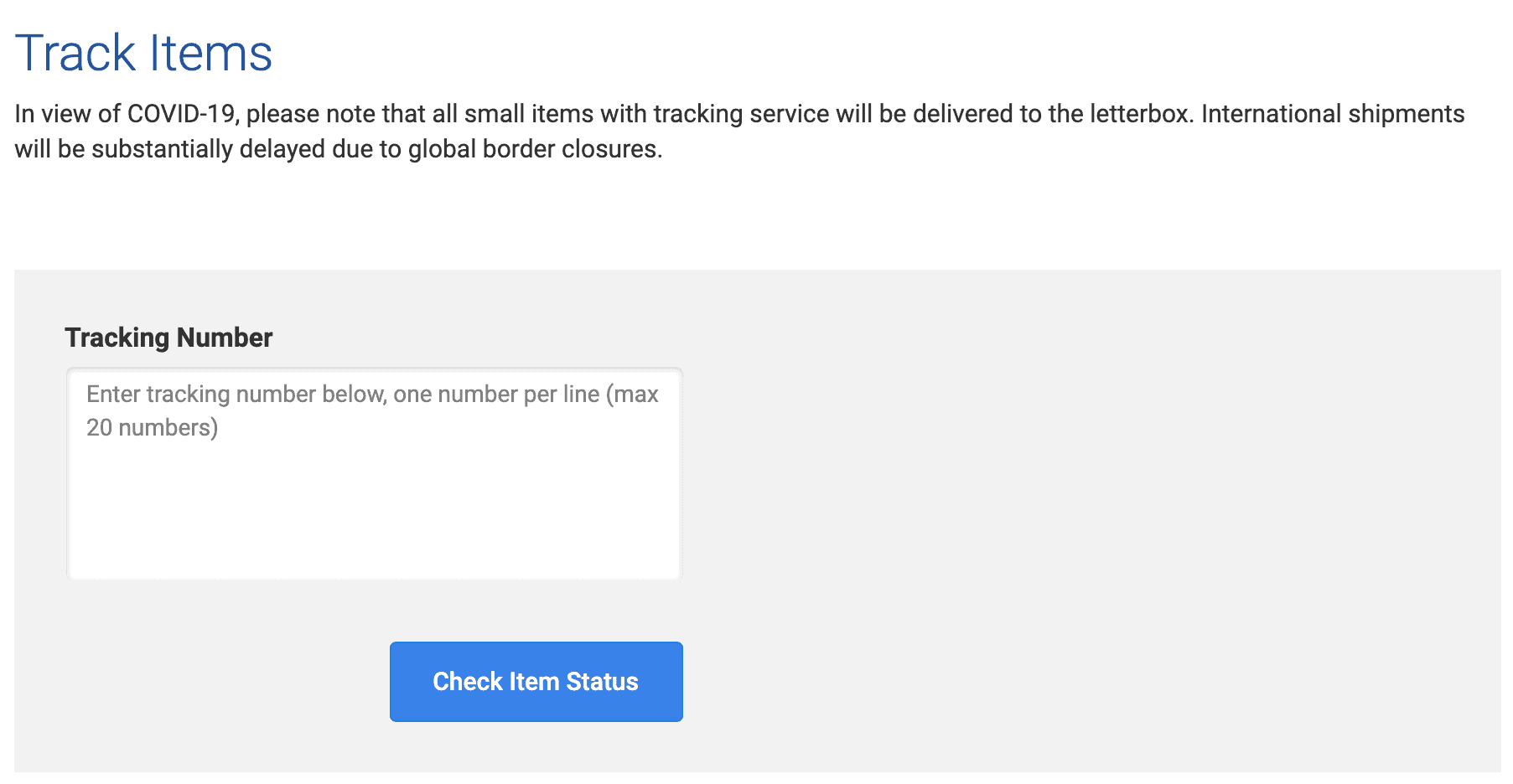
Having functional features on your website helps make the lives and user journey a lot easier and more convenient for visitors. It’s also a given nowadays that visitors or customers should be able to track packages to reassure them. Here’s an example, Singpost’s simple tracking function where you enter the tracking number and the system updates you with a progress bar
Functional features – shipping calculator
Having a shipping calculator on hand can help to avoid any post-purchase confusion or blame since shipping costs have already been calculated and presented upfront. Keep your interactions minimal like a drop-down menu and your design clean to ensure that users are not overloaded with information. Ninja Van SG having a dedicated page for choosing how you want to ship your parcels is a great example to follow. To further aid you in making a choice, here’s a recommendation – Woo Commerce provides extensions for eCommerce sites by offering shipping options, showing live rates from shipping carriers or adding inventory and fulfilment solutions.
Functional features – chatbot
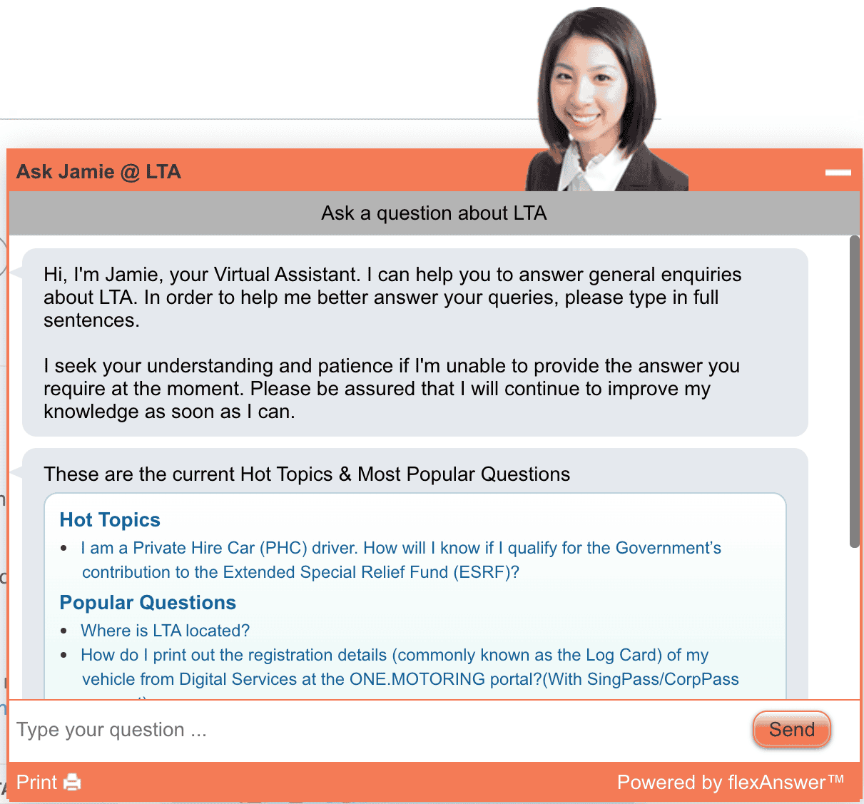
Having a chatbot can minimise click-aways – how? By increasing the quality of user engagement through providing personalised, relevant information and answering questions through a live chat. Integrating a chatbot with your business site is a great way of providing personalised services and getting your customers to remember your brand! A great example is the “Ask Jamie” chatbot on Singaporean government websites like the Land Transport Authority.
Now that you’ve seen a few tips on how to improve your website in the logistics industry, think about how you can implement these ideas to make your boss happy, and you work smarter and not so hard. For further reading, here are a 5 best website design features to inspire you for 2020. Also, drop us a message if you need any advice on how to start integrating these aspects into your site, we’ll be happy to help!
