National Kidney Foundation (NKF)
Website, Creative Design

Overview
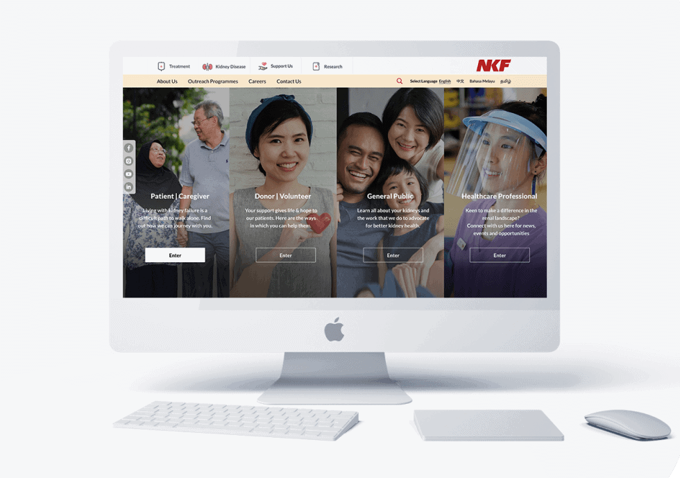
To help destigmatise the medical condition of kidney disease, our work with the National Kidney Foundation (NKF) consisted of a website refresh for the new decade. Drawing on our User Interface and User Experience knowledge to develop a site that is user-friendly to their different audience segments, we also created something that celebrated their staff, donors, patients and supporters.
The Challenge
To create a website the reflected the modernity of NKF today and position it as the leader in renal care. We also had to develop the site such that it was user-friendly for care-takers and those not very familiar with technology.
Our Impact
Through our in-depth research, we understood the various pain points faced by users of the old NKF website. We strategised a website that would allow users to discover more about which audience segment they are and other aspects about NKF they did not know.
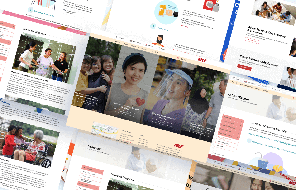
Through developing various User Journeys, we also mapped out paths that would feel intuitive to the various online NKF visitors. Our use of UX writing also played an important role in helping create site navigation and ensuring a smooth flow as the user explores the site.
In designing this website, we also considered the balance of animation, photographs and iconography. Whether it is an article about how to speak to patients about kidney issues or a short video on how can a family member provide, each page was carefully considered and designed with the intent to tell a story and increase NKF’s brand perception.
- REVAMP OF INFORMATION ARCHITECTURE
- WEBSITE DESIGN AND DEVELOPMENT
- USER INTERFACE AND USER EXPERIENCE


