When it comes to generating more sales for your business, how do you convert visitors into returning customers? How do you ensure that your website has the right features to maximise your sales output/numbers and generate ROI? Are you doing E-Commerce development the right way?
Well-designed landing pages can be a vital tool in attracting new customers, converting their initial excitement into sales, and if all goes well, repeat clients.
Check out the following guidelines to help craft an impactful landing page that stands out from the deluge of commercial ads. Do your business right, get your website development done well.
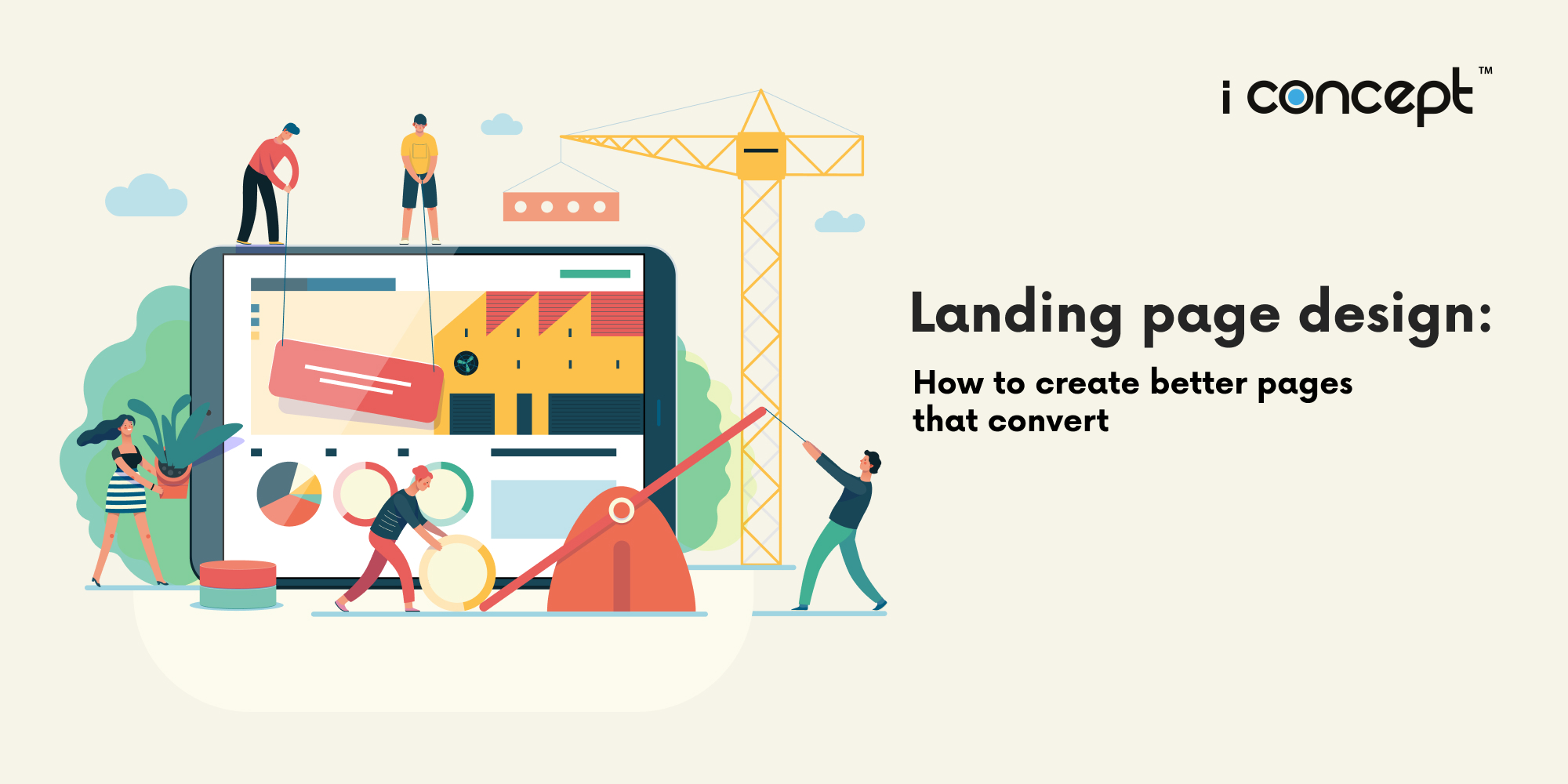
Why use a landing page?
Landing pages are sections of your website design that live separately from the main site, where your customers “land,” in order to showcase one targeted focus or point that you want to drive home.
Landing pages are great for the following:
- capturing email addresses and information
- promoting a product
- offering a discount
- inviting people to an event
- any other business targets
Landing pages, when properly utilised, direct users to your call-to-action (CTA), hopefully driving your visitors to convert that lead.
Decide on the objective for your landing page
Are you trying to achieve too many things at once? Have you decided the business goal for each particular landing page? By designing your website from the goal backwards, it allows you to ensure your content matches your target. Landing pages with multiple offers get 266% fewer leads than single offer pages. So stay focused.
Some designers, in trying to add lots of fancy, colourful graphics to set their websites apart from the competition, also create more distractions. Make sure that you don’t lose visitors’ attention and that all roads lead to your single objective.
Landing pages can serve many functions, but most commonly, landing pages are created to drive leads or to sell products or services.
Decide what kind of landing page you are going to create first
Purchase-driven landing pages are used to provide users with information about your product, service, offering, or brand. They are focused on driving sales for that specific product.
Lead-generation-driven or lead-capture landing pages are often referred to as Squeeze pages. The purpose of lead capture landing pages is to gather the visitor’s personal data, usually their name and email address. These pages usually have no exit path from the page, no links or navigation – only a CTA button to submit the requested details.
Decide how to drive traffic to your landing page
When designing your marketing strategy, you need to keep in mind your sales funnel and buyer journey to guide the decisions behind using each channel and link in the chain.
The table below outlines a typical suggested buyer’s journey for businesses. When considering overall marketing strategy, keeping the buyer’s journey in mind will help your team better understand how to push traffic, generate sales, and drive conversions.
Consider the digital channels you will use to drive traffic to your landing page. The target audience and purpose behind your landing page should help inform these decisions and drive your strategy. According to Hubspot, 61% of online marketers say generating traffic and leads is their biggest challenge.
Will you use social media, like Facebook, to run ads to your landing page? Write press releases? How will you lead the target audience to this landing page curated specifically for them?
Visitors can be directed to a landing page from a number of locations:
- Organic traffic
- Search engine ads
- Paid social media
- Print advertising
- Social media
- Native ads
- TV commercials
- Press releases
- Media
- Sponsored/third-party articles
- And other traditional marketing
Tips for designing the great landing page
- Organising: Getting your information across clearly
When someone clicks on your landing page, it should be easy to find the information they are seeking. An easy way to achieve this, is to add simple headlines that direct guests to pertinent information you deem important on this page. Subheadings are also a proven method for helping visitors navigate your content. Don’t have busy navigation headers or links on the sides that can distract visitors from your end goal – your conversion.
Be clear in the content of your headings and subheadings, so visitors can locate the information quickly and efficiently. And don’t be afraid to use bullets or consistent patterns, so users can travel the page with ease.
- Captivate: Add some videos and visual content that gets attention
By adding multimedia elements like videos, you can definitely increase traffic to your landing page. Using videos on landing pages can increase conversions by more than 80%. However, make sure to do so selectively, so you do not take away from the main focus. Also, bear in mind that attention spans are not long, so make sure your video can get to the point in a reasonable amount of time.
Carefully selecting quality, relevant graphics and images will help your landing page stand out from the competition. However, too many stimuli can draw the viewer’s eye away from the page’s content or CTA button. So be sure that it is engaging without being distracting.
A/B testing the colours and page placement of these features can help you determine the best move for your unique landing page. How will you know? Using A/B testing can help you evaluate which decisions generate the most results, including colour schemes, image location, form placement, and many others. You will read more about this later.
If the goal of your landing page is to direct customers to complete an action at the bottom of the page, then adding too many links in the header, footer, or sides of the landing page can often lead traffic away from your objective. You will garner more conversions this way, funnelling them to your CTA.
A creative design agency can help you with creating the content and visuals that work.
- Word well: Write content with actual answers
Eye-catching headlines and wonderful graphics are great, but if your landing page still does not provide the answers that viewers are seeking, not only will you lose their attention, you will also lose their respect for your site. If your advertisement, email, or landing page promises something, your content should deliver accordingly.
And that is where fine digital copywriting comes into play.
By establishing a reputation for your business as a company that consistently delivers on customer expectations, you will continue to generate quality traffic and sales.
By knowing your customers, you can be sure to emphasise the priorities important to them. This could mean emphasizing the value of your provided service over the cost. If cost is the main driving factor, then low prices or discounts might be a better tactic to motivate visitors to click on your CTA.
- Load well: Make sure your landing page loads fast
As mobile networks continue to thrive and wired networks take a back seat, business implications will change and companies should be prepared to take the necessary steps to stay on the cutting edge of today’s ever-evolving technological advancements.
Without super fast download speeds, you risk losing customers – and sales – due to a lagging and lacking user experience. Research has shown that 53% of mobile users leave a website that takes longer than three seconds to load.
So ensure that your landing page and website are always on par with the loading speed, or you risk losing the majority of impatient visitors who live on the internet (and on mobile view).
- Have a focus: Create eye-catching CTAs to drive conversions
The main focus of your entire landing page is your call-to-action, where the actual conversion happens. This could be to sign up for a service, buy a product, submit information, or any number of items.
Don’t be afraid to be specific in your directions. If you expect customers to do something, be clear.
Ensure that your CTA button or link is easy to locate, so that visitors do not have to actively search for it. Reduce the chances that they will overlook it on your page by choosing colours that highlight it on your page.
Don’t be afraid to change the language on the actual CTA button or link to reflect more appealing lures. Some have found that natural language does better here than prefabricated lines like “Sign Up Now.”
Make sure that when visitors actually complete the task you have set out for them, this should generate a Thank You page or pop-up, showing your appreciation for their action. It is important to validate the customer and make them feel understood. You can even pair this with discounts on a future purchase.
If you want to make your CTA a little more visually appealing, it can even be embedded in a video.
- Improve: Optimise your landing page on the regular
How do you optimise? Do A/B testing. Look at your traffic. See what works and what does not work based on the results of your reporting.
Are you pulling in different segments than you intended? Maybe you want to design and target different groups than the ones you were successful in reaching. Reevaluate and redesign your strategy around that. For your E-Commerce, you may want to do a campaign focused more towards women and one towards men. Is your focus on the wrong product? Is it at the wrong price point?
There are online tools you can use to evaluate your site’s performance, to do heat mapping and understand page visitor behaviour. See where your users are hovering the most on your page. Where are they spending time, what are they avoiding, and what is not working in your page layout. Refine, retune, test, and start segmenting more if your campaign is working well.
Start Creating Fantastic Web Experiences
You can have a fancy website design with a million and one features, but you need to get a landing page that’s perfect and will help you get the viewers and customers you want. These tips will help make your landing page relevant to your target customer, who will be glad to click in and look around.
Tempted to get started on creating your business’ very own E-Commerce platform? You may want the help of the people in the know to make it great. At I Concept Singapore, your preferred creative design agency in Singapore, we have a team of creative strategists, designers, and programmers who will be able to lend you a hand in creating your dream E-Commerce website. Apart from website design and website development, we offer a whole load of other related services, including digital marketing and branding.
What’s more, if you are looking to start up an E-Commerce development, you get to tap on the Productivity Support Grant (supported by Enterprise Singapore) and enjoy up to 50% subsidy in developing your webstore! The grant encourages SMEs to turn to digital solutions to increase productivity.
When it comes to website design and E-Commerce development, trust us to put in the essentials, and jazz it up to your liking. Get in contact with us and let’s start talking about your brand’s very own distinctive website.
