If you haven’t been seeing the news lately, healthcare has kinda been a big thing since the start of 2020. No points will be given to those who can guess why though. While on the topic of healthcare, for those are thinking about taking your practice one step further, have you ever thought about ways to improve or crisis-proof your business? One of the ways we know is to either improve or revamp your website. How? By taking into account User Interface and User Experience design factors, these tips to help make your site be more user-friendly to those looking for answers to healthcare issues. Other than taking a course in experience design, here are some of the website design tips plus UI and UX factors we’re gonna cover include the navigation bar, user flow and responsive web design choices as they help make the entire user experience more engaging and smooth.
Let’s get into it!
Navigation bar
The navigation bar is one of the first things that visitors see. It is a User Interface element that organises the rest of the website that makes browsing through it, intuitive. Mashable has a bit to say about designing the navigation bar and more often than not, the navigation bar is divided according to content. HMI Group, for example, has a clean and minimalist navigation bar that shares about their business, careers with them and how to contact them.
Page flow/user flow
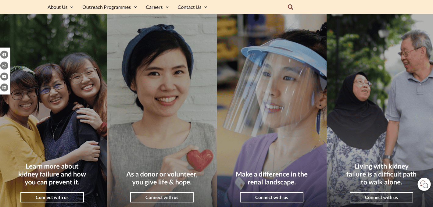
A user flow map consists of the various touchpoints between the user and website as well as their actions completed over time. Having such a map can help understand the areas that will experience the highest amount of interaction between users and help strategically place content there, that will make the biggest impact. This feature translates into planning for visitors who visit your site in different capacities. For example, the National Kidney Foundation Singapore’s website has roles like a donor, medical professional and patient that visitors can select. A user journey map plans out the content, making the journey each visitor takes, that much more engaging.
Responsive design
Having a responsive design means that almost all visitors, regardless of the platform can view your site at its best. How important is responsive design you might ask, well it adapts to the platform (smartphone or tablet) you are viewing the site on and optimises content for the best viewing experience. This might look like the navigation bar compressed to a hamburger (3 horizontal lines on top of each other) where visitors can click to expand the menu. An example of this would be our home page at I Concept!
Desktop view
![]()
Mobile view
![]()
Functional features – Quiz
Including functional features is a definite no-brainer. One of the functions that we recommend for healthcare sites is a short quiz. This quiz can drive engagement, raise awareness through gamification and help gather data as well. Quizzes/surveys help to improve the conversion rate by providing greater data on what visitors may need in order to complete a purchasing action after viewing your website.

With these website design tips, do think about how you can take your business to the next level and let your tech work for you. Drop us a message to find out more, if not stay home and stay safe!
