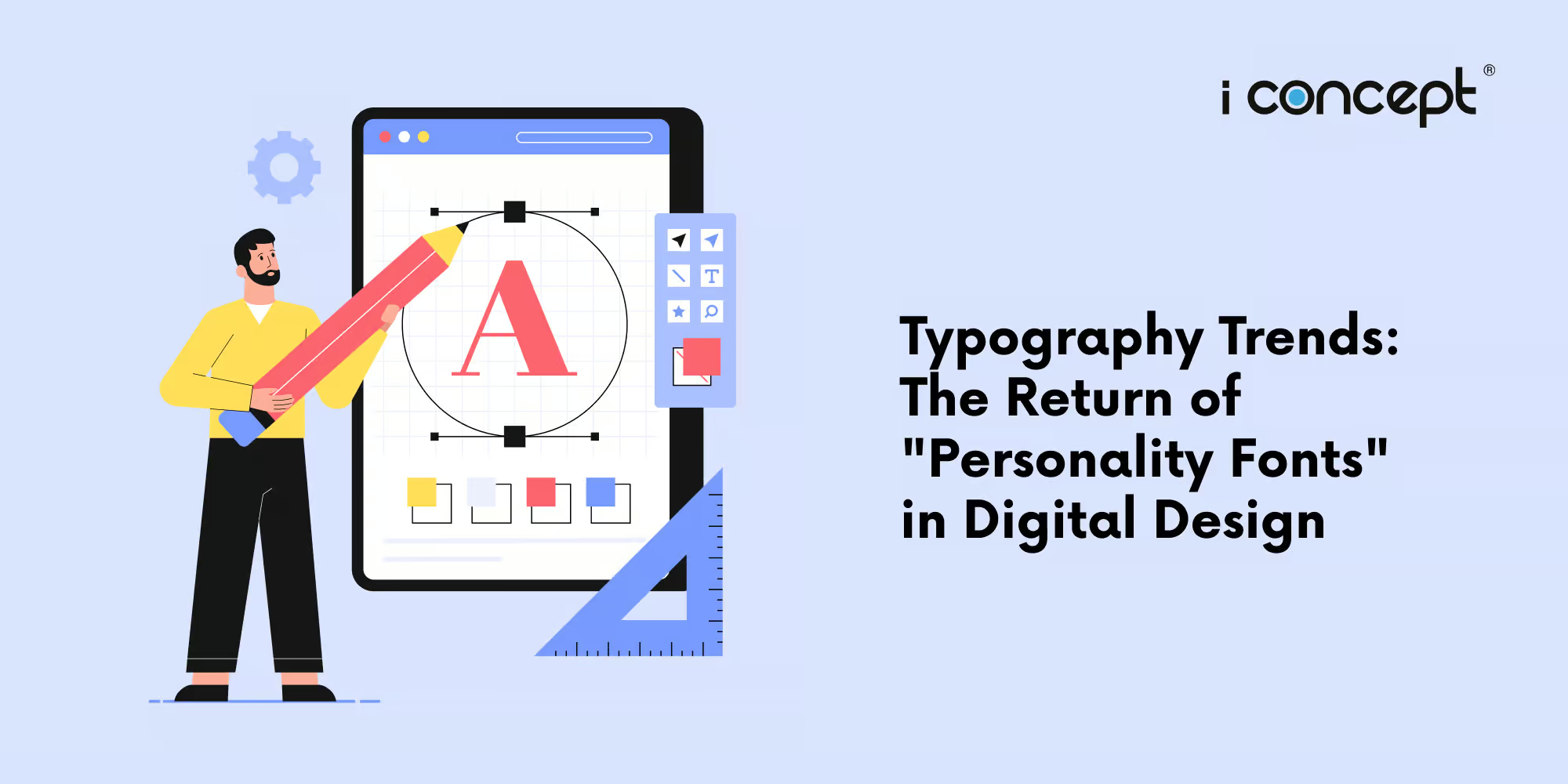
For years, typography trends in digital design were dominated by a specific kind of “quiet” aesthetic. Driven by the need for mobile responsiveness and fast load times, brands gravitated towards ultra-clean, neutral sans-serifs – the kind of “Blandification” that made every tech startup and fashion label look remarkably similar.
However, as we move through 2026, a “tactile rebellion” is taking place. In a world saturated with AI-generated perfection, designers are intentionally breaking the mould. We are witnessing the triumphant return of Personality Fonts: typefaces that prioritise character, emotion, and “human” imperfection over sterile efficiency.
The Psychology of the “Human Touch”
Typography functions as the “body language” of digital design, transmitting subconscious signals before a single word is actually read. In an era of automated content, the psychological weight of a font choice has never been more significant. Empirical research indicates that font psychology can influence brand trust by up to 40%, while aligning typography with a specific consumer intent can increase conversion rates by as much as 35%
In 2026, the digital aesthetic has pivoted from “neutrality” to “narrative.” This shift represents a move away from the “safe,” homogenous grids of the past decade toward a more expressive, high-character approach. Current design movements are utilising:
- High-Contrast Serifs: Featuring dramatic transitions between thick and thin strokes, these letterforms evoke a sense of heritage, editorial authority, and quiet luxury. They provide a sophisticated visual “anchor” for high-end digital experiences.
- Chunky, Liquid Geometrics: Characterised by “ink traps” and rounded, bulbous terminals, these fonts offer a tactile, friendly quality. They serve as a direct, playful rebuttal to the sterile, “cold” minimalism that dominated the early 2020s.
- Hand-Rendered Imperfections: By incorporating intentional “glitches,” asymmetrical terminals, and organic ink-bleed effects, designers are embedding a “human signature” into the digital canvas. This signals authenticity in a market increasingly wary of algorithmic perfection.
Case Study: How Custom Typography Strengthens Global Brands
Global market leaders are demonstrating that bespoke typography is not merely a stylistic preference, but a primary driver of brand equity and operational efficiency.
Netflix famously transitioned to its custom typeface, Netflix Sans, to solve a multi-million-dollar problem. By moving away from licensed fonts, the streaming giant reportedly saved millions in annual licensing fees while simultaneously gaining a typeface optimised for legibility across diverse devices – from mobile screens to cinematic displays.
Similarly, Airbnb (Cereal) and Duolingo (Feather Bold) have leveraged custom typography to bridge the gap between digital utility and emotional connection. These “signature fonts” ensure a consistent brand voice across fragmented global markets, with industry data suggesting that unique typography can boost brand recognition by up to 80%. By owning the very “DNA” of their written communication, these brands ensure that even in the absence of a logo, their identity remains unmistakable.
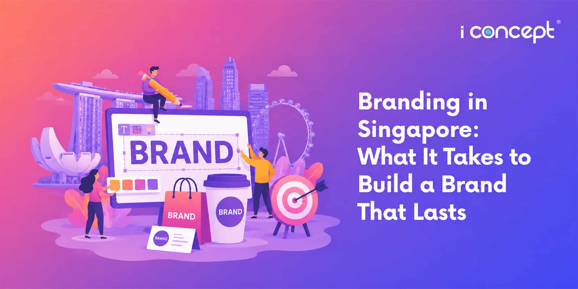
Bridging the Gap in the Singapore Market
In the local context, branding in Singapore has reached a tipping point. With the rise of the digital economy, having a “good enough” website is no longer sufficient. Whether you are a heritage brand looking to modernise or a newcomer seeking to disrupt, your typography choice is a strategic business decision.
As an integrated creative agency, we at I Concept Singapore understand that design doesn’t exist in a vacuum. It must be paired with sharp digital copywriting and marketing and a robust technical foundation. We specialise in helping businesses navigate these shifts and championing their branding in Singapore and beyond. From the initial logo design for the company to full-scale ecommerce development, we ensure that every touchpoint reflects a cohesive and compelling brand personality.
Empowering Your Business Growth
We recognise that the transition to high-impact design requires investment. As a certified creative agency, we guide our clients through available support frameworks in Singapore. Many businesses are eligible to offset the costs of digital transformation through:
- Productivity Solutions Grant (PSG): Ideal for SMEs looking to adopt pre-scoped digital solutions, including specific web and ecommerce enhancements.
- Enterprise Development Grant (EDG): For companies looking to undertake deeper, more strategic projects in branding, process redesign, or overseas expansion.
Our team at I Concept Singapore doesn’t just “pick fonts.” We build visual systems that resonate with your audience and drive measurable results. In an era where everyone is using the same tools, the only way to stand out is through authentic, high-quality design that refuses to be “bland.”
Start the Conversation
Is your brand’s visual voice getting lost in the noise? Let’s find the “personality” that sets you apart.
Contact I Concept Singapore today to explore how our integrated creative solutions can elevate your digital presence and drive your business forward in 2026 and beyond.