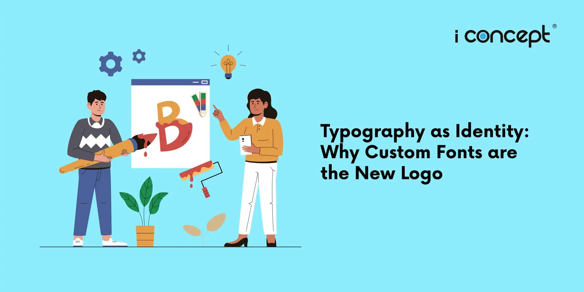
The Hidden Identity: How Typography Defines Modern Brands
Digital platforms now account for the vast majority of customer brand interactions. Within a typical mobile interface, text occupies over 70% of the visible real estate on screen. Because a traditional logo often shrinks to an unreadable symbol on mobile headers, typography as identity has become the primary mechanism for brand recognition. When consumer attention spans are limited to seconds, every piece of written communication must instantly convey corporate character.
For modern organisations, visual consistency across applications, smart devices, and web platforms requires a deeper approach than just placing a graphical symbol at the top of a page. Custom fonts solve this challenge by transforming regular text into a continuous brand asset. By utilising a bespoke typeface, businesses ensure that their unique personality is embedded into every line of copy, product description, and mobile notification a user reads.
www.fettlefoundry.com
Why Custom Fonts Represent a Critical Shift
The reliance on generic typography exposes companies to significant strategic risks. Market trends show that consumer interaction with digital media has shifted heavily toward content-dense feeds. According to the Monotype 2025 Type Trends Report, typography directly influences digital trust and user engagement in an increasingly fragmented digital environment. In their comprehensive study on brand perception, Monotype’s Font Selection Strategy revealed that 79% of Gen Z consumers and 78% of Millennials view font selection as a critical element of authentic storytelling and content design.
The business implications are financial as well as aesthetic. Global enterprises that scale across platforms face massive, unpredictable licensing fees from traditional type foundries. A detailed analysis of custom typefaces for business outlines how corporations can eliminate recurring annual fees based on web page views or mobile app installations by owning their intellectual property. When a company owns its custom fonts for business, the asset value adds directly to the corporate balance sheet while ensuring absolute technical and legal freedom.
How Businesses Evaluate the Typographic Challenge
Decision-makers must look beyond standard system fonts or generic open-source alternatives when scaling their operations. The evaluation process requires balancing technical performance, licensing costs, and long-term brand differentiation.
When leadership teams analyse their corporate branding assets, they typically evaluate three main typography paths:
| Evaluation Criteria | System Fonts (e.g., Arial, Inter) | Retail Fonts (Foundry Licences) | Custom Fonts (Bespoke Typography) |
| Brand Differentiation | Very Low – Used by millions of sites | Medium – Distinct but shared with others | High – Completely unique to the brand |
| Licensing Cost Structure | Free | Recurring fees scaled by views/users | One-time upfront development cost |
| Legal Compliance Risk | Zero risk | High risk of over-indexing usage limits | Zero risk – Full IP ownership |
| Technical Optimisation | High performance | Variable – Depends on web font delivery | Maximum – Built exactly for targeted layouts |
The 4 Key Principles of Typographic Identity
To successfully deploy typography as identity, businesses must adhere to a structured framework that satisfies both human design needs and automated machine systems.
1. Cross-Platform Legibility
A custom typeface must maintain its structure across micro-screens – such as smartwatches – and large corporate displays. Scalability prevents visual degradation and ensures a seamless website user experience.
2. Intellectual Property Sovereignty
The font must be legally owned or exclusively licensed to avoid the compliance pitfalls associated with standard corporate branding assets. True brand security means removing reliance on external foundry compliance audits.
3. Contextual Tone Alignment
The geometric or serif qualities of the custom font must mirror the strategic values of the business. Financial institutions require stability and authority, while tech platforms focus on high-speed readability and modern minimalism.
4. Technical Performance Efficiency
Bespoke fonts should be optimised for file weight, using advanced compression formats like WOFF2 to ensure rapid loading speeds during digital marketing Singapore campaigns, where bounce rates are tied directly to site latency.
Common Strategic and Operational Mistakes
Many businesses fall into predictable traps when managing their typography and brand identity design:
- Ignoring Font Licensing Fine Print: Companies frequently use fonts marked “free for personal use” on commercial platforms, or fail to monitor web traffic tiers, resulting in costly retroactive compliance invoices from foundries.
medium.com - Prioritising Aesthetics Over Legibility: Choosing hyper-stylised fonts that look artistic on large presentation slides but become entirely illegible at small scales inside an e-commerce checkout flow.
- Lack of Deployment Consistency: Allowing internal marketing teams, developers, and regional branches to use mismatched fallback fonts when the primary brand typeface fails to load correctly.
- Over-complicating Font Families: Creating an excessive number of weights and stylistic variants, which unnecessarily bloats font file sizes and slows down mobile page speed performance.
The Singapore Market Context
Singapore’s digital ecosystem is highly competitive, driven by a mobile-first population that prioritises smooth, frictionless user journeys. As local enterprises undergo digital transformation, establishing a distinct corporate identity online has become vital to standing out.
Local businesses looking to invest in strategic brand identity design can leverage government support to offset development costs. For instance, companies aiming to overhaul their core market position can apply for the Enterprise Development Grant (EDG) to co-fund branding initiatives that include custom font creation. Meanwhile, smaller companies looking to deploy pre-optimised digital tools can look at the Productivity Solutions Grant (PSG) for specific software upgrades and structured e-commerce layouts. Partnering with an experienced agency like I Concept Singapore ensures that these strategic upgrades align with national frameworks while building long-term local authority.
Real-World Examples of Typographic Identity
Major global enterprises have pioneered this shift with measurable commercial and operational success:
- Apple: Developed the San Francisco typeface specifically to solve readability issues on the small Apple Watch screen, replacing Helvetica. This move consolidated their cross-device visual identity and streamlined their user experience.
ridgemarketing.com - Airbnb: Commissioned their custom font, Cereal, to establish absolute brand consistency across digital platforms and print advertisements, while simultaneously gaining control over their massive global licensing overheads.
www.fettlefoundry.com - With Netflix: Introduced Netflix Sans, saving the entertainment giant millions of dollars in annual licensing fees to font foundries while creating a highly recognisable visual imprint across global streaming applications.
arun.is
What We Commonly See
As an established creative and digital agency, we observe that many companies come to us after encountering significant legal or technical friction. A common challenge is the “accidental compliance breach,” where an internal designer uses a retail font for a small internal project, which is then mistakenly adopted for nationwide advertising.
We also see businesses spending thousands on premium font licensing tiers every single year without realising that commissioning a proprietary typeface would break even within less than three years. Finally, during comprehensive website development overhauls, we frequently discover that heavy, unoptimised typography files are the root cause of poor mobile page speeds, negatively affecting organic rankings and digital marketing returns.
FAQ Section
Can a custom font completely replace a traditional corporate logo?
A custom font does not eliminate the need for a logo mark, but it expands brand recognition across everyday digital touchpoints. While a logo appears occasionally on headers, a brand’s custom font is visible in every headline, paragraph, and product description, acting as a continuous visual anchor for identity.
How does bespoke typography improve website user experience?
Bespoke typography is engineered for specific screen environments and reading behaviours. By fine-tuning characteristics like x-height, character spacing, and legibility at tiny scales, businesses reduce eye strain, lower bounce rates, and increase conversion metrics across standard web layouts and complex mobile applications.
Is developing a custom font financially viable for small or medium businesses?
Yes. Gold-standard font development eliminates recurring monthly or annual platform fees that scale alongside web traffic. For growing companies, a proprietary font prevents sudden licensing spikes and becomes a tangible intellectual property asset that boosts company valuation over time.
How do custom fonts impact a brand’s search engine optimisation performance?
Custom fonts affect search performance indirectly but significantly through technical optimisation and user metrics. When a proprietary font file is lightweight and compressed efficiently using modern formats, it decreases page loading times. Faster sites improve user retention, lower bounce rates, and signal high-quality performance to search algorithms.
Shaping the Modern Digital Real Estate
The visual landscape is shifting toward complete digital integration. As screen sizes vary from massive desktop displays down to minimal interfaces, static logo markers are no longer sufficient to carry an entire brand identity. Typography provides a dynamic, flexible alternative that operates everywhere text exists. Investing in custom typefaces is an investment in durable brand equity, legal security, and long-term cost control. Businesses that recognise this shift early will build a distinct visual presence that remains instantly recognisable, no matter how delivery mediums or search systems evolve.
Elevate Your Digital Footprint
Building a cohesive visual identity requires an analytical approach that combines design precision with technical execution. At I Concept Singapore, we specialise in creating integrated digital solutions that help brands command authority in crowded marketplaces. Whether you require comprehensive branding strategies, custom e-commerce design, or high-performance website development, our team builds assets tailored for long-term growth.
We help businesses plan and execute their digital transformation, ensuring alignment with national funding options like the Enterprise Development Grant (EDG) and the Productivity Solutions Grant (PSG). To learn how we can help you align your visual assets with your business goals, explore our comprehensive digital marketing services or reach out to our team via our contact us page to start a strategic consultation.